Designing for Accessibility: Making Clock Apps Usable for Everyone
The digital age has brought us countless conveniences, and one of the most fundamental is the ubiquitous clock. From our smartphones to our televisions, clocks are integrated into nearly every device we use. However, the design of these clocks often overlooks a crucial aspect: accessibility. Creating clock interfaces that are usable by everyone, regardless of their abilities, is not just a matter of ethical design; it's also a matter of good design. This article explores the best practices for crafting clock designs that meet accessibility standards and ensure inclusive user experiences.
Why Accessibility Matters in Clock Design
Accessibility is about making products and services usable by people with a wide range of abilities, including those with visual, auditory, motor, and cognitive impairments. When it comes to clock design, the implications are significant. Consider these scenarios:
- Visual Impairments: Users with low vision, color blindness, or other visual impairments may struggle to read clock faces with poor contrast or small text.
- Cognitive Differences: Individuals with cognitive differences may find it challenging to interpret complex clock layouts or understand unconventional time representations.
- Motor Impairments: Users with motor impairments may have difficulty interacting with touch-based clock interfaces or navigating complicated menus.
By prioritizing accessibility, we can create clock designs that are not only functional but also empowering, allowing everyone to easily access and understand time. This is particularly relevant for clock applications designed for larger screens like TVs, where visibility and ease of use are paramount, especially if the app is intended to function as a screensaver.
Key Principles of Accessible Clock Design
Here are some fundamental principles to guide the development of accessible clock designs:
1. Contrast: Ensuring Visibility
Contrast is the difference in luminance or color that makes an object (like the clock hands or numbers) distinguishable from the background. Insufficient contrast can make it difficult, if not impossible, for people with visual impairments to read the clock face.
- WCAG Guidelines: The Web Content Accessibility Guidelines (WCAG) provide specific contrast ratio requirements for text and non-text elements. Aim for a contrast ratio of at least 4.5:1 for normal text and 3:1 for large text (18pt or 14pt bold) against the background.
- Color Choices: Be mindful of color combinations. Avoid pairing colors that are difficult to distinguish, such as red and green (important for users with red-green color blindness). Use color contrast tools to test your color schemes. There are also many contrast checking tools available online.
- Customizable Themes: Provide users with the ability to customize the clock's color scheme. Offer pre-set themes with high contrast options and allow users to create their own custom themes based on their individual needs. For a TV clock app, consider themes optimized for different viewing environments (daytime, nighttime).
2. Font Size and Legibility: Clear and Readable Text
The font size and legibility of the clock's numbers and text labels are crucial for users with visual impairments.
- Minimum Font Size: Choose a font size that is large enough to be easily read at a typical viewing distance. Consider that users might be viewing the clock from across a room, especially if it’s on a TV screen.
- Clear Font Choices: Select fonts that are easy to read, even at small sizes. Avoid overly decorative or stylized fonts. Sans-serif fonts are generally considered more legible than serif fonts.
- Adjustable Font Sizes: Allow users to adjust the font size to their preferences. This is especially important for TV clock applications, as viewing distances can vary significantly. Implementing a zoom feature would greatly improve usability, too.
- Text Spacing: Ensure sufficient spacing between letters, words, and lines of text to improve readability. Avoid cramming text together.
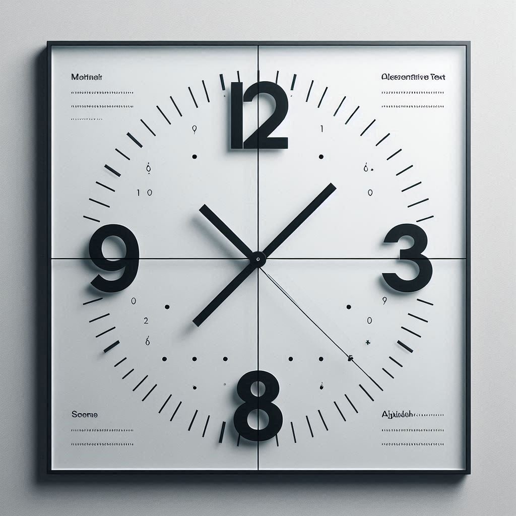
3. Alternative Text for Visual Elements: Describing Images and Icons
If your clock design includes visual elements such as icons or decorative images, provide alternative text descriptions for screen readers.
- Descriptive Alt Text: Write alt text that accurately describes the purpose and meaning of the visual element. For example, if you have an icon representing an alarm, the alt text could be "Alarm icon."
- Contextual Alt Text: Tailor the alt text to the context in which the visual element is used. Provide more detailed descriptions when necessary.
- Empty Alt Text for Decorative Images: If an image is purely decorative and does not convey any essential information, use an empty alt text attribute (alt="") to signal to screen readers that it should be ignored.
4. Keyboard Navigation: Ensuring Accessibility for All
Many users rely on keyboard navigation to interact with digital interfaces. Even in TV environments where remote controls are common, ensuring keyboard accessibility is vital for users with motor impairments or those who prefer alternative input methods.
- Logical Tab Order: Ensure that the focus order follows a logical and intuitive path through the interactive elements of the clock interface.
- Visible Focus Indicators: Provide clear and visible focus indicators to show users which element currently has focus. Use a high-contrast outline or other visual cue.
- Keyboard Shortcuts: Implement keyboard shortcuts for common actions, such as setting alarms or changing clock settings.
- Remote Control Compatibility: For TV clock apps, ensure that all functions are fully accessible using the remote control's directional buttons and select button.
5. Audio Feedback: Providing Auditory Cues
Audio feedback can enhance the accessibility of clock interfaces for users with visual impairments.
- Time Announcements: Provide an option for the clock to announce the time at regular intervals or on demand.
- Alarm Notifications: Use distinct and easily recognizable audio cues for alarm notifications.
- Confirmation Sounds: Play sounds to confirm actions, such as setting an alarm or changing a setting.
- Adjustable Volume: Allow users to adjust the volume of audio feedback to their preferences.
6. Screen Reader Compatibility: Making Content Accessible to Screen Readers
Screen readers are software programs that allow users with visual impairments to access digital content by converting text and other elements into speech or Braille.
- Semantic HTML: Use semantic HTML elements (e.g.,
<header>,<nav>,<main>,<article>,<h1>to<h6>,<button>) to structure your clock interface. This provides screen readers with valuable information about the content's organization and hierarchy. - ARIA Attributes: Use Accessible Rich Internet Applications (ARIA) attributes to add semantic information to elements that are not inherently accessible. For example, use
aria-labelto provide a descriptive label for a button oraria-liveto announce dynamic content updates. - Testing with Screen Readers: Regularly test your clock interface with popular screen readers, such as NVDA, JAWS, or VoiceOver, to identify and fix accessibility issues.
7. Customizable Preferences: Empowering Users to Personalize Their Experience
One of the most effective ways to improve accessibility is to provide users with the ability to customize the clock interface to their individual needs and preferences.
- Theme Selection: Offer a variety of pre-set themes with different color schemes, font sizes, and contrast levels.
- Font Customization: Allow users to choose their preferred font family, size, and weight.
- Time Format Options: Provide options for displaying time in 12-hour or 24-hour format, with or without seconds.
- Date Format Options: Allow users to choose their preferred date format.
- Alarm Customization: Provide options for setting custom alarm tones, snooze durations, and repeat schedules.
- Notification Preferences: Allow users to customize the types of notifications they receive (e.g., alarms, timers, reminders) and how they are delivered (e.g., audio, visual, vibration).
8. Simplified Interface: Reducing Cognitive Load
A cluttered or overly complex clock interface can be overwhelming for users with cognitive differences.
- Clear Layout: Use a clear and logical layout that is easy to understand and navigate.
- Minimalist Design: Avoid unnecessary visual clutter. Focus on presenting essential information in a concise and straightforward manner.
- Consistent Terminology: Use consistent terminology and labeling throughout the interface.
- Step-by-Step Instructions: Provide clear and step-by-step instructions for common tasks, such as setting an alarm or changing a setting.
- Undo/Redo Functionality: Implement undo/redo functionality to allow users to easily correct mistakes.
9. Avoiding Seizures: Designing for Photosensitive Epilepsy
Certain visual patterns and animations can trigger seizures in individuals with photosensitive epilepsy.
- Avoid Flashing Lights: Avoid using rapid flashing lights or strobing effects.
- Avoid High-Contrast Patterns: Avoid using high-contrast patterns that are closely spaced together.
- Provide a Seizure Warning: Display a warning message at the beginning of the clock application to inform users about the potential for seizures.
- Offer a Seizure-Safe Mode: Provide a seizure-safe mode that disables potentially triggering visual effects.
Accessibility Considerations for TV Clock Apps
When designing clock apps for televisions, several additional accessibility considerations come into play:
- Viewing Distance: TV screens are typically viewed from a greater distance than computer monitors or mobile devices. This means that text and other visual elements must be larger and more legible.
- Remote Control Navigation: Users typically interact with TV apps using a remote control, which can be more challenging to navigate than a mouse or touch screen. Design the interface to be easily navigable using the remote control's directional buttons and select button.
- Screen Burn-In: If the clock app is intended to be used as a screensaver, be mindful of screen burn-in. Avoid displaying static elements for extended periods of time. Consider using a clock face that moves or changes periodically.
- Platform Accessibility Features: Take advantage of the accessibility features provided by the TV platform (e.g., Samsung Tizen TV, LG WebOS TV, Android TV, Amazon Fire TV). These features may include screen readers, high-contrast modes, and text-to-speech capabilities.
The Importance of User Testing
The best way to ensure that your clock design is truly accessible is to involve users with disabilities in the design and testing process.
- Early Involvement: Include users with disabilities in the early stages of the design process to gather their feedback and insights.
- Usability Testing: Conduct usability testing with users with disabilities to identify accessibility issues and areas for improvement.
- Iterative Design: Use the feedback from user testing to iteratively refine your design and make it more accessible.
Specific Examples of Accessible Clock Design Features
Here are some concrete examples of how you can incorporate accessibility features into your clock designs:
- Large Digital Clock Face with High Contrast: A simple digital clock face with large, easy-to-read numbers and a high-contrast color scheme. This is particularly beneficial for users with low vision.
- Analog Clock Face with Tactile Markings: An analog clock face with raised or textured markings for each hour and minute, allowing visually impaired users to feel the time.
- Spoken Time Announcements: A feature that allows the clock to announce the current time at regular intervals or on demand. This is especially helpful for users who are blind or have severe visual impairments.
- Customizable Color Schemes: A settings menu that allows users to choose from a variety of pre-set color schemes or create their own custom color schemes. This enables users to tailor the clock's appearance to their individual needs and preferences.
- Adjustable Font Sizes: A settings menu that allows users to adjust the font size of the clock's numbers and text labels. This ensures that the text is legible for users with varying degrees of visual impairment.
- Keyboard Navigation Support: Full keyboard navigation support for all interactive elements of the clock interface. This allows users with motor impairments or those who prefer alternative input methods to easily navigate the clock's features.
- Compatibility with Screen Readers: Ensuring that the clock interface is fully compatible with popular screen readers. This allows users with visual impairments to access and understand all of the clock's content and functionality.
By implementing these accessibility best practices, you can create clock designs that are not only functional and aesthetically pleasing but also inclusive and empowering for all users. Remember that accessibility is not just a feature; it's a fundamental aspect of good design. It’s about making technology usable and enjoyable for everyone, creating a better digital experience for all. Consider that a simple clock o clock style interface can be a great benefit to many people if correctly designed. Remember the diverse user base of platforms like Samsung Tizen TV, LG WebOS TV, Android TV, and Amazon Fire TV, and design with them in mind. The possibility of using your clock application as a screensaver should increase the care you give to visibility and long-term usability.