Typography Matters: Choosing the Right Fonts for Clock Displays
Typography, the art and technique of arranging type to make written language legible, readable, and appealing when displayed, is absolutely critical when designing clock displays. Whether it's a traditional analog clock face or a modern digital representation, the choices made regarding font style, size, spacing, and color significantly impact how easily and enjoyably users can tell the time. In the context of modern applications, including TV-based clock displays or screensaver apps, thoughtful typography elevates the user experience and transforms a simple functional element into a visually compelling one. This article delves into the key considerations for selecting and implementing effective typography for clock displays.
The Power of Legibility: More Than Just a Pretty Face
Legibility, the ease with which individual characters can be distinguished from one another, is paramount. A beautiful font is useless if users struggle to decipher the numbers or letters. Several factors contribute to legibility:
- X-Height: The x-height, the distance between the baseline and the top of lowercase letters (like 'x'), influences the perceived size and readability of a font. Fonts with larger x-heights generally appear larger and are easier to read at smaller sizes. This is particularly crucial for clock displays viewed from a distance, such as on a TV screen.
- Open Counters: Counters are the enclosed (or partially enclosed) areas within letters, such as the space inside 'o', 'd', or 'p'. Open counters prevent letters from appearing crowded or blurry, especially on lower-resolution displays. A closed counter can make a character like "8" or "0" indistinguishable.
- Stroke Contrast: Stroke contrast refers to the difference in thickness between the thickest and thinnest parts of a letter. High stroke contrast (common in some elegant serif fonts) can be visually striking but can also reduce legibility, especially when the font size is small or the display resolution is limited. Low stroke contrast fonts, often found in sans-serif designs, tend to be more legible in a wider range of conditions.
- Character Width: The width of each character also affects legibility. Fonts that are too condensed can feel cramped and difficult to read, while fonts that are too wide can take up excessive space and disrupt the overall layout.
For clock displays that function as screensavers or run on TV platforms like Samsung Tizen TV, LG WebOS TV, Android TV, or Amazon Fire TV, optimizing for legibility across various screen sizes and resolutions is essential. User interfaces (UI) for clock applications and clock widgets require font scaling options to enhance readability based on viewing distance and eyesight.
Serif vs. Sans-Serif: A Classic Debate
The choice between serif and sans-serif fonts is a fundamental consideration in typography.
- Serif Fonts: Serif fonts are characterized by small decorative strokes (serifs) at the ends of letter strokes. They are often perceived as traditional, elegant, and authoritative. Examples include Times New Roman, Georgia, and Garamond. While serifs can aid in guiding the eye across a line of text in print, their impact on legibility on digital displays is more nuanced. On lower-resolution screens, serifs can become blurry or distorted, reducing legibility. However, on high-resolution displays, well-designed serif fonts can impart a sense of sophistication and visual interest to a clock face.
- Sans-Serif Fonts: Sans-serif fonts lack serifs and tend to have a cleaner, more modern appearance. Examples include Arial, Helvetica, and Open Sans. They are generally considered more legible on digital displays, particularly at smaller sizes and lower resolutions. The simplicity of sans-serif fonts makes them well-suited for clock displays that prioritize clarity and ease of reading. Sans-serif typefaces often excel in the design of clock applications for Android TV and other smart TV platforms, offering a clear and unobtrusive display.
For a clock app designed for TV platforms, a versatile approach might involve offering users a choice between carefully selected serif and sans-serif fonts, allowing them to customize the display to their preferences and viewing conditions.
Size Matters: Finding the Sweet Spot
The size of the font is obviously a crucial determinant of legibility. The optimal font size depends on several factors:
- Viewing Distance: The further away the viewer is, the larger the font needs to be. A clock display intended to be viewed from across a living room requires a significantly larger font size than a clock display on a wrist-worn device.
- Screen Resolution: Lower-resolution screens require larger fonts to ensure that the characters remain clear and distinguishable. Higher-resolution screens can accommodate smaller fonts without sacrificing legibility.
- Font Style: Some fonts appear larger than others, even at the same point size. Fonts with larger x-heights tend to appear larger.
- User Preferences: Some users may prefer larger fonts for ease of reading, while others may prefer smaller fonts for a more minimalist aesthetic.
Clock applications intended for use on TV platforms should provide adjustable font size options to accommodate different viewing distances and user preferences. The user interface should ideally offer a preview of the font size before the user commits to the change.
Spacing and Leading: Giving Letters Room to Breathe
Even with a legible font and an appropriate font size, poor spacing can undermine the overall readability of a clock display.
- Kerning: Kerning is the adjustment of the space between individual pairs of letters to improve their visual appearance. For example, the space between 'W' and 'A' might be reduced to prevent them from appearing too far apart. Proper kerning is essential for creating a visually harmonious and legible display.
- Tracking (Letter-Spacing): Tracking, also known as letter-spacing, refers to the uniform adjustment of the space between all letters in a block of text. Increasing tracking can improve legibility, especially for smaller font sizes or fonts with tight letterforms. However, excessive tracking can make the text appear disjointed.
- Leading (Line-Height): While leading primarily applies to multi-line text, it can also be relevant for clock displays that include additional information, such as the date or day of the week. Leading is the vertical space between lines of text. Insufficient leading can make the lines of text appear crowded and difficult to read, while excessive leading can create too much separation.
Clock design should consider the proximity of numbers and other elements. Overlapping elements make it difficult to determine the actual time. Leading becomes especially important when additional information is included on the display.
Color and Contrast: Making the Numbers Pop
The color of the font and the background against which it is displayed play a critical role in legibility and visual appeal.
- Contrast: High contrast between the font color and the background color is essential for legibility. Black text on a white background (or vice versa) provides the highest contrast and is generally the easiest to read. However, other color combinations can also be effective, as long as there is sufficient contrast.
- Colorblindness: When choosing colors, it's important to consider users with colorblindness. Certain color combinations, such as red and green, can be difficult or impossible for colorblind individuals to distinguish. Using color contrast checkers during the design process will help mitigate potential accessibility issues.
- Ambient Lighting: The ambient lighting in the room can affect how colors are perceived. In dimly lit environments, lighter font colors on a dark background may be more legible. In brightly lit environments, darker font colors on a light background may be more suitable.
A customizable clock app may allow users to select from a range of color palettes to suit their preferences and viewing conditions. The user interface should provide a preview of the color combination before the user commits to the change. For TV apps specifically, consider the typical viewing environment, which often involves lower lighting conditions, and optimize the default color schemes accordingly.
Beyond the Basics: Font Personality and Aesthetic Considerations
While legibility is the primary concern, the choice of font also contributes to the overall aesthetic of the clock display. The font should reflect the desired style and personality.
- Modern vs. Traditional: Sans-serif fonts tend to convey a modern and minimalist aesthetic, while serif fonts often evoke a more traditional and elegant feel.
- Playful vs. Serious: Some fonts have a playful and whimsical character, while others are more serious and professional. The choice of font should align with the intended use case.
- Brand Identity: If the clock display is part of a larger brand, the font should be consistent with the brand's visual identity.
Clock apps with custom clock faces can offer a wide range of font choices to cater to diverse tastes and preferences. Consider curating a selection of fonts that represent different styles and personalities.
Practical Examples and Case Studies
Consider the following examples to illustrate the impact of typography on clock displays:
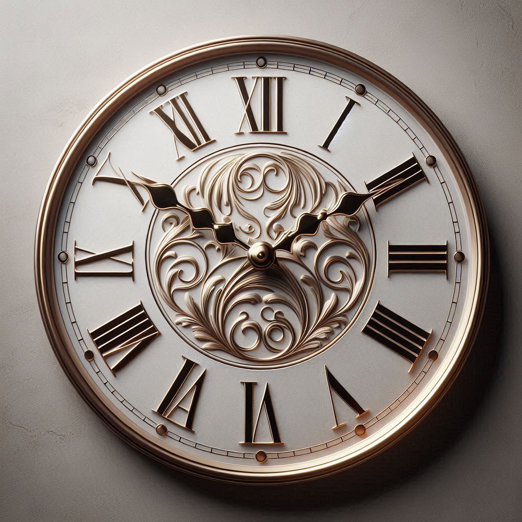
- Classic Analog Clock: A traditional analog clock face might use a serif font like Garamond or Times New Roman for the numbers, conveying a sense of timeless elegance. However, on a low-resolution display, a slightly bolder sans-serif alternative like Open Sans might offer improved legibility.
- Digital Clock on TV: A digital clock app designed for a TV might use a clean, sans-serif font like Roboto or Helvetica Neue, optimized for readability from a distance. The font size would be significantly larger than that used on a smaller screen.
- Minimalist Clock Widget: A minimalist clock widget might use a thin, sans-serif font like Lato or Montserrat, emphasizing simplicity and unobtrusiveness. The font color might be subtle, blending in with the background.
These examples demonstrate how the optimal font choice depends on the specific context and design goals. Analyzing successful clock designs and understanding the rationale behind their typographic choices can provide valuable insights.
Tools and Resources for Font Selection
Numerous online resources can assist in the process of selecting and evaluating fonts:
- Google Fonts: A vast library of free and open-source fonts, with filtering options for serif, sans-serif, and other styles.
- Adobe Fonts: A subscription-based service offering a wide range of high-quality fonts from leading type foundries.
- FontPair: A website that helps you discover harmonious font pairings.
- Typewolf: A resource showcasing examples of typography in web design.
These tools can help you explore different font options and find the perfect typeface for your clock display. Additionally, many image editing and design software packages offer advanced typographic controls, allowing you to fine-tune kerning, tracking, and leading.
The Future of Clock Typography
As display technology continues to evolve, so too will the possibilities for clock typography. High-resolution displays and advanced rendering techniques will enable the use of more intricate and expressive fonts. Variable fonts, which allow for fine-grained control over font weight, width, and other characteristics, offer exciting new possibilities for customization. Moreover, accessibility will continue to be a major driver of innovation, with a focus on creating clock displays that are usable by people with a wide range of visual impairments. Adaptive typography, which automatically adjusts font size, color, and spacing based on the user's viewing conditions and preferences, will become increasingly common.
In conclusion, typography is a critical element in the design of effective and visually appealing clock displays. By carefully considering factors such as legibility, font style, size, spacing, color, and aesthetic, designers can create clock faces that are both functional and beautiful. Whether it's a simple digital clock or a complex analog design, thoughtful typography elevates the user experience and transforms a mundane task – telling the time – into a delightful visual experience. For developers of clock TV apps for platforms like Samsung Tizen TV, LG WebOS TV, Android TV, or Amazon Fire TV, understanding and applying these principles of typography are key to creating a successful and engaging product. The ability to customize clock faces with a variety of fonts makes the experience that much richer, enabling users to create the perfect visual element for their living space.