Seasonal Clock Designs: Adapting Interfaces for Different Times of Year
The concept of time is universal, yet our perception of it is profoundly influenced by the seasons. The changing weather, the shifting daylight hours, and the cultural associations we attach to each time of year all shape how we experience the passage of time. This influence extends to the digital realm, where clock design offers a unique canvas for reflecting the beauty and significance of each season. This article delves into the creative possibilities of seasonal clock designs, exploring how you can adapt interfaces to capture the essence of winter frosts, spring blooms, summer sunsets, and autumnal hues. Whether you're a designer seeking inspiration or simply someone who appreciates the artistry of a well-crafted display, this exploration will offer a wealth of ideas.
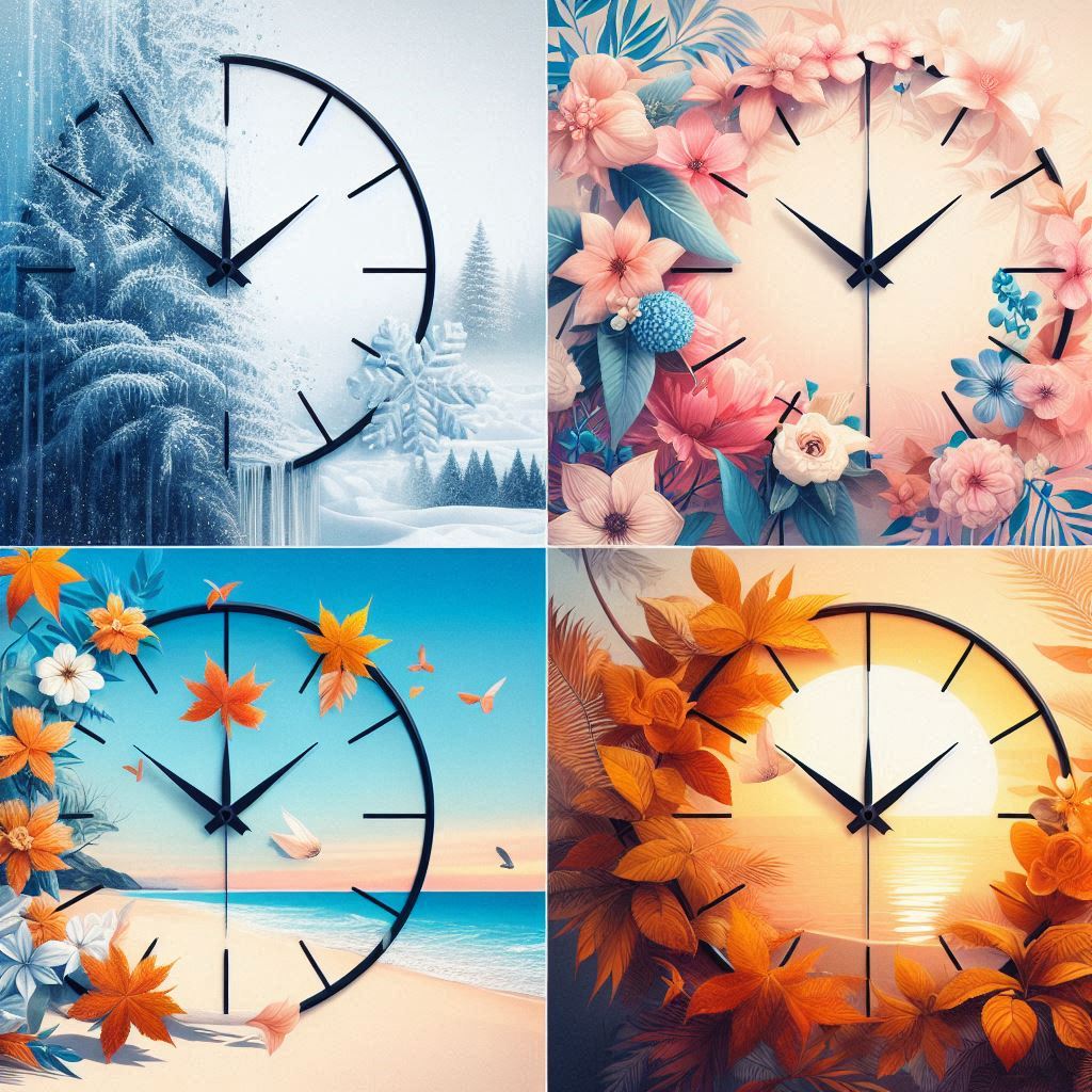
The Allure of Seasonal Themes in Clock Design
Why embrace seasonal themes in clock design? The answer lies in the power of visual storytelling and the ability to create a more engaging and personalized experience. A clock that reflects the current season connects us to the natural world, reminding us of the cyclical rhythms that govern our lives. It can evoke feelings of warmth in the winter, joy in the spring, relaxation in the summer, and contemplation in the fall. Furthermore, a seasonally themed clock can add a touch of festive spirit to any space, particularly during holidays and special occasions.
A Journey Through the Seasons: Clock Design Ideas
Let's embark on a journey through the seasons, exploring specific design ideas for each:
Winter: Embracing the Chill
Winter, often associated with snow, ice, and tranquility, offers a rich palette of design possibilities:
- Color Palette: Think cool blues, icy whites, shimmering silvers, and deep charcoals. Consider gradient backgrounds that transition from a light sky blue at the top to a darker, almost navy blue at the bottom, mimicking the winter twilight.
- Imagery: Delicate snowflakes gently falling across the screen, intricate ice crystals forming and dissolving, or stylized snow-covered landscapes can create a serene winter atmosphere. Avoid overly realistic depictions of snowstorms, as they can appear chaotic and distracting. Focus on elegance and minimalism.
- Fonts: Choose clean, crisp fonts that evoke a sense of clarity and precision. Sans-serif fonts with a slightly rounded edge can soften the overall look. Consider using a subtle drop shadow to add depth and dimension to the numerals.
- Animation: Subtle animations can bring the winter theme to life. A gentle shimmering effect on the numerals, a slow rotation of snowflakes, or a faint pulsing glow can add a touch of magic. Avoid overly aggressive or distracting animations.
- Metaphorical Representation: Instead of literal depictions of snow, explore abstract representations of winter. Perhaps a minimalist design featuring concentric circles in shades of blue and white, representing the rings of a frozen pond.
- Scandinavian Influence: Draw inspiration from Scandinavian design principles: simplicity, functionality, and natural materials. A clock face made to resemble wood with carved, minimalist numbers would fit nicely.
- Holiday Integration (Subtly): Around Christmas and New Year, consider adding very subtle nods to the holidays – perhaps a few twinkling stars in the background or a momentary change in the color scheme. However, maintain the overall winter theme and avoid overtly festive imagery outside of the immediate holiday period.
Spring: A Burst of Renewal
Spring signifies rebirth, growth, and vibrant energy. Capture this essence with:
- Color Palette: Embrace a spectrum of fresh greens, pastel pinks, sunny yellows, and sky blues. Consider using gradients that mimic the blooming flowers and emerging foliage.
- Imagery: Blooming flowers, sprouting leaves, playful butterflies, or images of birds returning north can create a sense of joy and optimism. Avoid overly detailed or cluttered imagery. Focus on clean lines and vibrant colors.
- Fonts: Opt for fonts that are light, airy, and slightly whimsical. Script fonts can add a touch of elegance, but ensure they are legible.
- Animation: Gentle animations of flowers swaying in the breeze, butterflies fluttering across the screen, or leaves unfurling can bring the spring theme to life.
- Growth Visualization: Consider a clock design where the numbers gradually "grow" from small seeds to full blooms as the day progresses. This visual metaphor perfectly captures the essence of spring.
- Nature Sounds (Optional): If your platform allows, integrate subtle nature sounds like birdsong or a gentle breeze. These sounds should be unobtrusive and soothing, rather than jarring.
- Rain Showers Theme: A clock design featuring gentle rain showers and blossoming flowers, using a soft pastel color palette, could be both calming and visually appealing.
Summer: Embracing the Sun
Summer evokes warmth, relaxation, and long, sunny days:
- Color Palette: Use warm oranges, vibrant yellows, deep blues, and sandy beiges. Consider gradients that mimic the sunset or the ocean.
- Imagery: Sunsets, beaches, palm trees, or images of sailboats gliding across the water can create a sense of tranquility and escape.
- Fonts: Choose fonts that are bold, confident, and easy to read in bright sunlight. Sans-serif fonts with a slightly rounded edge can convey a sense of relaxation.
- Animation: A subtle animation of waves lapping on the shore, clouds drifting across the sky, or sunlight shimmering on the water can add a touch of realism.
- Abstract Heat Visualization: Instead of literal depictions of the sun, use abstract representations of heat and energy. Perhaps a design featuring radiating lines in shades of orange and yellow.
- Nautical Theme: Incorporate nautical elements like anchors, ropes, and compasses for a classic summer feel.
- Beach Sand Timer Simulation: Design a digital clock face to mimic a sand timer on a beach, with the "sand" (pixels or shapes) slowly accumulating to represent the passage of time.
Autumn: A Season of Change
Autumn, often associated with falling leaves, harvest, and cozy evenings, offers a unique design aesthetic:
- Color Palette: Embrace warm browns, rich oranges, deep reds, and golden yellows. Consider gradients that mimic the changing leaves on the trees.
- Imagery: Falling leaves, pumpkins, acorns, or images of harvest fields can create a sense of warmth and nostalgia.
- Fonts: Choose fonts that are classic, elegant, and slightly rustic. Serif fonts with a slightly aged appearance can add character.
- Animation: A gentle animation of leaves falling from a tree, wind blowing through the branches, or smoke rising from a chimney can add a touch of realism.
- Harvest Bounty: Incorporate elements of harvest bounty, such as cornucopias or stylized representations of fruits and vegetables.
- Geometric Leaf Patterns: Create abstract patterns using geometric shapes inspired by autumn leaves. This approach offers a modern and sophisticated take on the season.
- Sunset Inspired Clock Face: Design a clock face with a color scheme that replicates a beautiful autumn sunset, transitioning from warm oranges and reds to deep purples as the day progresses.
Technical Considerations for Seasonal Clock Designs
Beyond the aesthetic considerations, there are several technical factors to keep in mind when designing seasonal clock faces:
- Platform Compatibility: Ensure that your designs are compatible with the platforms you are targeting (Samsung Tizen TV, LG WebOS TV, Android TV, and Amazon Fire TV). Different platforms have different capabilities and limitations.
- Performance: Optimize your designs for performance. Avoid overly complex animations or high-resolution images that can slow down the device. Consider using vector graphics instead of raster graphics for scalability and performance.
- Battery Life (If Applicable): If your clock app is used on portable devices (e.g., Android TV boxes with limited power), be mindful of battery consumption. Minimize animations and use efficient coding practices.
- Customization Options: Allow users to customize their clock faces to their liking. This could include options to change the color scheme, font, or imagery. Consider offering pre-set themes for each season.
- Accessibility: Ensure that your clock faces are accessible to users with visual impairments. This includes using high contrast colors, providing alternative text for images, and ensuring that the time is clearly displayed. Consider offering a spoken time option.
- Screen Burn-in (OLED TVs): Be mindful of screen burn-in issues, especially on OLED TVs. Avoid static elements that remain in the same position for extended periods. Design elements should shift positions slightly over time to mitigate burn-in. This is particularly important when the clock is used as a screensaver.
- Download Size: Keep the download size of your clock faces as small as possible. This is especially important for users with limited storage space.
Psychology of Color and Seasonal Association
The choice of colors in seasonal clock design is deeply rooted in the psychology of color and our cultural associations:
- Winter: Blues and whites evoke feelings of calmness, peace, and coldness.
- Spring: Greens and yellows evoke feelings of growth, renewal, and optimism.
- Summer: Oranges and yellows evoke feelings of warmth, energy, and happiness.
- Autumn: Browns and reds evoke feelings of warmth, nostalgia, and comfort.
Understanding these psychological associations can help you create clock designs that resonate with users on an emotional level.
Beyond the Visuals: Adding Seasonal Functionality
While visual appeal is paramount, consider adding seasonal functionality to your clock app:
- Sunrise/Sunset Times: Display the sunrise and sunset times for the current day. This is particularly relevant in the summer and winter, when daylight hours vary significantly.
- Weather Information: Display the current weather conditions and forecast. This can help users plan their day accordingly.
- Seasonal Events: Display upcoming seasonal events and holidays.
- Seasonal Quotes: Display inspiring quotes related to the current season.
The Power of Personalization
Ultimately, the most successful seasonal clock designs are those that allow for personalization. Give users the ability to customize their clock faces to reflect their individual tastes and preferences. This could include options to change the color scheme, font, imagery, and animation. The more control users have, the more likely they are to connect with your app.
Conclusion: Time and Transformation
Seasonal clock design offers a powerful way to connect us to the natural world and enhance our experience of time. By embracing the unique aesthetics of each season, you can create clock faces that are both beautiful and meaningful. Whether you're designing for a TV app on Samsung Tizen TV, LG WebOS TV, Android TV, or Amazon Fire TV, the possibilities are endless. By carefully considering the color palette, imagery, fonts, and animations, you can transform a simple timekeeping device into a captivating work of art. By keeping performance, accessibility, and other technical considerations in mind, you can ensure that your clock faces are not only visually appealing but also functional and user-friendly. So, embrace the changing seasons and let your creativity blossom! Remember to optimize your app for screensaver usage, ensuring it's both energy-efficient and visually engaging for prolonged display. By providing high-quality, customizable clock faces, you can cater to a wide audience and stand out in the competitive app market.