Harnessing Negative Space: How White Space Enhances Clock Readability
In the realm of user interface (UI) and user experience (UX) design, few elements are as potent yet often overlooked as negative space. Often referred to as white space (though it doesn't necessarily have to be white), it's the blank area around and between design elements. This seemingly empty canvas plays a crucial role in shaping the way we perceive and interact with visual information, and it’s particularly important when designing interfaces for devices like TVs, where viewing distances and screen sizes present unique challenges. This is especially true for elements we use for practical purposes, such as a clock, where instant readability is essential. This article delves into the importance of negative space in clock design, particularly its impact on readability and overall user experience.
What is Negative Space?
Before diving into the specifics of clock design, let’s define negative space more precisely. It is the area surrounding the primary elements in a design. Think of the space between letters in a word, the margin around a paragraph of text, or the area surrounding a button on a screen. It’s the absence of content that paradoxically contributes to the overall composition. It is an essential part of design, particularly when considering devices where the display may be viewed from a distance, such as on a Smart TV. In that environment, it becomes more critical to emphasize readability, particularly in core functions such as the display of time.
The Power of White Space in Visual Communication
Negative space isn't just empty room. It’s an active element that:
- Enhances Readability: By giving each element "breathing room," negative space reduces visual clutter, making it easier for the eye to focus and process information. This is vital for clock applications intended for larger screens, where ease of viewing is paramount.
- Improves Comprehension: When elements are less crammed together, the brain can more easily distinguish between them, leading to improved comprehension and reduced cognitive load. Consider how much easier it is to read a book with generous margins than one with text crammed to the edges.
- Creates Visual Hierarchy: Strategic use of negative space can guide the viewer's eye to the most important elements on the screen, establishing a clear hierarchy of information. For instance, a larger amount of negative space around the current time on a digital clock face will draw the user's attention to it.
- Establishes Mood and Tone: The amount and distribution of negative space can influence the overall feeling of a design. Generous negative space often conveys a sense of elegance, sophistication, and simplicity, while a lack of it can create a feeling of busyness, urgency, or even anxiety.
- Balances the Design: Just as a photograph needs balance between subject and background, a UI needs balance between content and empty space. A well-balanced design is more pleasing to the eye and easier to navigate.
Readability in Clock Design: Why Negative Space Matters
In the context of a clock design, especially one intended for use on a TV, readability is paramount. Users need to be able to quickly and easily discern the time from a distance, often with only a glance. This makes the effective use of negative space absolutely crucial.
Consider these aspects:
- Digit Clarity: For digital clocks, the shape and spacing of the digits themselves are critical. Sufficient negative space within each digit, as well as between digits, prevents them from blurring together, especially when viewed from a distance on a large screen. Imagine a clock face with tightly packed, complex digits – it would be far more difficult to read than one with clear, well-spaced numbers.
- Analog Clock Face Legibility: On an analog clock face, the same principles apply. The space between the hour markers, the numerals (if present), and the clock hands is essential for distinguishing each element. A cluttered analog clock face with minimal negative space is hard to decipher. Too much going on between the indicators and the hands, and it's just hard to see the time.
- Background Contrast: The contrast between the digits (or clock hands) and the background is another important factor in readability. Using a darker color for the digits against a lighter background (or vice versa) creates strong visual separation. However, even with good contrast, excessive clutter in the background can diminish readability. Thoughtful use of negative space around the time helps emphasize its importance and draws the user's focus.
Designing for the TV Screen: Unique Challenges and Opportunities
Designing a clock application for a TV presents distinct challenges compared to designing for a mobile phone or computer. The primary difference lies in viewing distance. Users typically view TVs from several feet away, whereas phones and computers are viewed much closer. This difference necessitates a different approach to UI design, with a greater emphasis on clarity and simplicity.
- Increased Font Sizes: Text must be larger and bolder to be legible from a distance. This also means digits and hands on a clock have to be sized appropriately for comfortable viewing.
- Simplified Visuals: Complex graphics and animations can be distracting and difficult to process from a distance. A clean, minimalist design with ample negative space is generally preferable.
- Color Considerations: Colors appear differently on a large TV screen than on a smaller device. It’s important to choose colors that are easily distinguishable and that don't cause eye strain.
- Optimize for Different Resolutions: TV screens come in a wide range of resolutions, from standard definition to 4K and beyond. The UI design must be scalable to accommodate different screen sizes and resolutions without losing clarity or proportion. This often involves vector-based graphics that can scale without pixelation.
Examples of Effective Negative Space Use in Clock Designs
Let's examine some examples of how negative space can be effectively used in clock designs:
- Minimalist Digital Clock: A minimalist digital clock often features large, sans-serif digits displayed against a plain background. The ample negative space around each digit ensures maximum readability, even from a distance. Consider the popular screensaver styles that employ this approach.
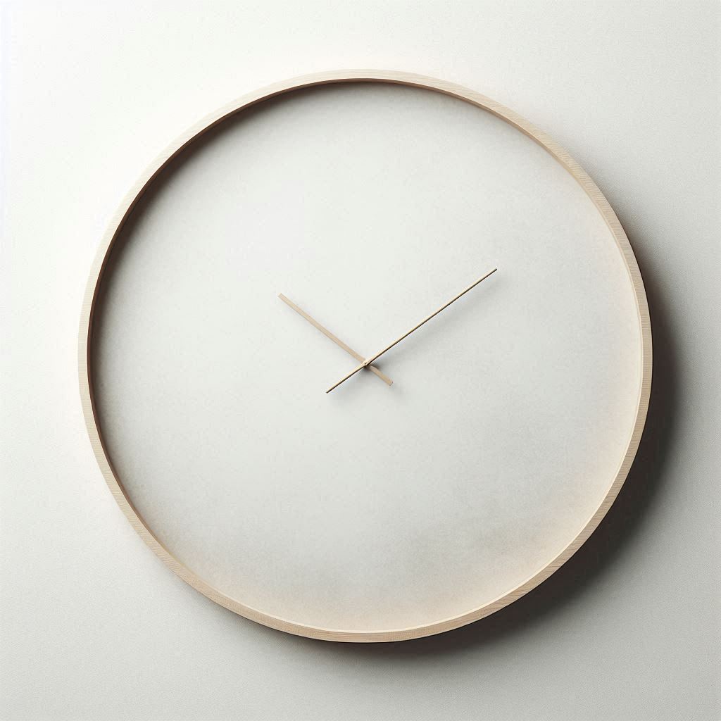
- Elegant Analog Clock: An elegant analog clock design might use thin, refined hands and subtle hour markers, surrounded by a generous amount of empty space on the clock face. This creates a sophisticated and uncluttered look.
- Themed Clocks with Selective White Space: Even clocks that incorporate themes or imagery can benefit from strategic negative space. For instance, a clock face with a subtle background image should still prioritize clarity by ensuring ample space around the digits or hands, preventing the image from overpowering the time display.
- Clock o clock Approach: Consider the approach used in " clock o clock" TV app - they are created to be easily readable and enjoyable to watch from various distances, with use of minimalistic design and the use of negative space.
Common Pitfalls to Avoid
While negative space is a powerful design tool, it's also easy to misuse. Here are some common pitfalls to avoid:
- Too Little Negative Space: Cramming too much information into a small space is the most common mistake. This leads to visual clutter and makes it difficult for users to find the information they need.
- Inconsistent Spacing: Inconsistent spacing between elements can create a jarring and unprofessional look. It's important to maintain consistent margins, padding, and line heights throughout the design.
- Ignoring Visual Hierarchy: Failing to use negative space to guide the viewer's eye can result in a confusing and ineffective UI. The most important elements should be given the most visual prominence through the strategic use of empty space.
- Using Distracting Backgrounds: A busy or overly detailed background can compete with the foreground elements (such as the digits on a clock), making them difficult to read. Backgrounds should be subtle and unobtrusive.
- Over-Reliance on Borders: While borders can sometimes be useful for separating elements, they can also add unnecessary clutter. In many cases, negative space alone is sufficient to create visual separation.
Practical Tips for Incorporating Negative Space in Your Clock Design
Here are some practical tips for incorporating negative space effectively into your clock design:
- Start with a Minimalist Approach: When beginning a new design, start with a minimalist approach and gradually add elements as needed. It’s easier to add than to subtract. This helps you prioritize only essential information.
- Prioritize Readability: Always prioritize readability above all else. Experiment with different font sizes, colors, and spacing to find the optimal combination for legibility, especially when designing for TV screens.
- Use Grids and Guides: Use a grid system to ensure consistent spacing and alignment. Grids provide a framework for creating a well-structured and visually balanced design.
- Test on Different Devices: Test your design on a variety of devices and screen sizes to ensure that it looks good and functions well on all platforms. Pay particular attention to how the design appears on large TV screens.
- Get Feedback: Get feedback from users and iterate on your design based on their input. User feedback is invaluable for identifying areas where the design can be improved.
- Consider the Viewing Distance: Remember the intended viewing distance. Designs for TVs need more negative space than designs for mobile devices.
- Experiment with Different Layouts: Don't be afraid to experiment with different layouts and arrangements of elements. Sometimes, a simple rearrangement can make a big difference in readability and visual appeal.
- Analyze Existing Designs: Study examples of well-designed clocks and other UIs to see how they use negative space effectively. Pay attention to the spacing, alignment, and overall composition of the design.
- Use the Right Tools: Employ design tools that allow for precise control over spacing and layout, ensuring consistency and accuracy in your implementation.
- Iterate Based on User Testing: After initial designs, conduct user testing to observe how real users interact with your clock. Identify any areas where readability suffers or where the design feels cluttered. Use this feedback to iterate and refine your use of negative space.
The Benefits of a Well-Designed Clock Experience
Investing in a well-designed clock application, with a focus on negative space and readability, offers several benefits:
- Improved User Satisfaction: A clock that is easy to read and visually appealing will lead to greater user satisfaction.
- Increased Engagement: Users are more likely to use an app that is enjoyable and easy to interact with.
- Enhanced Brand Perception: A well-designed app reflects positively on the brand and enhances its reputation.
- Reduced Support Costs: A clear and intuitive UI reduces the need for user support and minimizes user frustration.
- Better Accessibility: Good use of negative space can improve accessibility for users with visual impairments.
Conclusion
Negative space is a critical element of effective UI design, particularly when it comes to clock applications intended for TV screens. By understanding the principles of negative space and applying them thoughtfully, designers can create clock interfaces that are not only visually appealing but also highly readable and user-friendly. Prioritizing negative space leads to a more intuitive and enjoyable experience for users. Whether it's a minimalist digital clock or an elegant analog clock, the judicious use of empty space can transform a simple timekeeping device into a design masterpiece. " clock o clock", with its focus on minimalistic approach, takes all of this into account when providing a seamless experience.