Color Theory in Clock Design: Creating Visual Impact
Color is more than just decoration; it's a fundamental element of design that profoundly impacts how we perceive and interact with the world around us. This is especially true in user interface (UI) design, where the right color choices can enhance usability, communicate information effectively, and create a pleasing aesthetic experience. In the realm of clock design, where instant readability and clear information display are paramount, understanding and applying color theory becomes even more crucial. Whether it's a digital clock gracing a TV screen or a minimalist analog face on a smartwatch, the colors chosen significantly influence how easily and enjoyably we can tell the time.
The Fundamentals of Color Theory
Before diving into specific applications for clock interfaces, let's review some core concepts of color theory:
The Color Wheel: A visual representation of colors arranged according to their chromatic relationship. The most common model is the 12-color wheel, derived from the RYB (Red, Yellow, Blue) primary colors. Understanding the relationships between colors on the wheel is fundamental to creating harmonious and effective color palettes.
Primary, Secondary, and Tertiary Colors:
- Primary: Red, yellow, and blue. These colors cannot be created by mixing other colors.
- Secondary: Green, orange, and purple. Created by mixing two primary colors.
- Tertiary: Created by mixing a primary color with a neighboring secondary color (e.g., red-orange, blue-green).
Color Harmonies: Pleasing combinations of colors based on their relationships on the color wheel. Common harmonies include:
- Complementary: Colors opposite each other on the color wheel (e.g., red and green). High contrast, often used for emphasis.
- Analogous: Colors that are adjacent to each other (e.g., blue, blue-green, green). Create a harmonious and calming effect.
- Triadic: Three colors evenly spaced on the color wheel (e.g., red, yellow, blue). Offers high visual interest while maintaining balance.
- Monochromatic: Variations of a single hue, achieved by adjusting the saturation and value (brightness). Simple and elegant.
- Tetradic (or Rectangle): Using two complementary pairs on the color wheel. Requires careful balancing to avoid overwhelming the viewer.
- Square: Four colors equally spaced on the color wheel. Similar to tetradic, demands skill in balancing dominance.
Hue, Saturation, and Value (HSV): A common way to define colors digitally:
- Hue: The pure color (e.g., red, blue, green).
- Saturation: The intensity or purity of the color (how much gray is mixed in).
- Value: The brightness or darkness of the color. Also known as lightness.
Color Temperature: Colors are often described as warm (reds, oranges, yellows) or cool (blues, greens, purples). Warm colors tend to be energizing and attention-grabbing, while cool colors are often associated with calmness and serenity.
Color and Readability in Clock Interfaces
Readability is paramount in any clock design. If the time is not easily discernible at a glance, the clock fails its primary purpose. Color plays a significant role in achieving optimal readability.
- Contrast: The difference in luminance (brightness) between the foreground (clock elements) and the background. High contrast improves readability, especially in challenging lighting conditions or for users with visual impairments. For example, bright white numerals against a dark background offer excellent contrast. Conversely, similar shades of color (e.g., light gray on white) should be avoided. Tools are available to calculate color contrast ratios to ensure accessibility compliance.
- Foreground and Background Considerations: The color of the clock hands, numerals, and other elements (foreground) must stand out against the background. Dark backgrounds are generally preferred for digital clocks, allowing bright, easily visible characters. Analog clocks often utilize light backgrounds with dark hands and numerals, a classic and time-tested approach.
- Color Blindness: A significant percentage of the population experiences some form of color vision deficiency (color blindness). Designers must consider this when choosing color palettes. Red-green color blindness is the most common. Avoid relying solely on red and green as the only means of conveying information. Use alternative cues such as different shapes, patterns, or text labels. Tools are available to simulate how a design appears to people with different types of color blindness.
- Ambient Lighting: The surrounding lighting environment can significantly impact how colors are perceived. A clock designed for a brightly lit room may not be easily readable in a dimly lit room. Consider offering themes or settings that allow users to adjust the color scheme based on ambient lighting conditions. Night mode features, which automatically switch to darker color schemes at night, are particularly beneficial.
Color and Mood: Evoking Emotional Responses
Color is intrinsically linked to emotions and psychological associations. Choosing the right colors for a clock interface can subtly influence the user's mood and perception of time.
Warm Colors:
- Red: Associated with energy, excitement, passion, and sometimes danger or urgency. Red can be used sparingly in clock designs to highlight important information, such as alarms or timers. Overuse of red can be overwhelming.
- Orange: Represents enthusiasm, creativity, and warmth. Orange can create a cheerful and inviting clock face.
- Yellow: Associated with optimism, happiness, and intellect. Yellow can be used to create a bright and energetic clock display. However, light yellows can be difficult to read against light backgrounds.
Cool Colors:
- Blue: Represents calmness, serenity, trust, and stability. Blue is a popular choice for clock interfaces, as it is generally considered relaxing and easy on the eyes.
- Green: Associated with nature, growth, health, and tranquility. Green can create a soothing and refreshing clock display.
- Purple: Represents royalty, luxury, wisdom, and spirituality. Purple can add a touch of elegance and sophistication to a clock face.
Neutral Colors:
- Black: Represents power, elegance, sophistication, and mystery. Black is often used for backgrounds in digital clocks, providing excellent contrast for bright text.
- White: Represents purity, cleanliness, simplicity, and peace. White is a classic choice for clock faces, creating a clean and minimalist aesthetic.
- Gray: Represents neutrality, balance, and sophistication. Gray can be used to create a subtle and understated clock design.
Consider the intended use of the clock when selecting colors. A clock intended for use in a bedroom might benefit from calming blues and greens, while a clock designed for a kitchen might utilize more energetic yellows and oranges.
User Perception and Cultural Considerations
Color associations are not universal. Different cultures may have different interpretations of color meanings. Designers should be aware of these cultural nuances, especially when creating clock interfaces for international audiences.
- Cultural Significance: For example, white is often associated with mourning in some Eastern cultures, while it represents purity and celebration in Western cultures. Red can symbolize good luck and prosperity in China but might represent danger or warning in other cultures. Research the cultural significance of colors in the target audience's region before making design decisions.
- Personal Preferences: Individual preferences also play a significant role. Some users may prefer bright, vibrant colors, while others may prefer more subdued and muted tones. Providing customization options allows users to personalize the clock interface to suit their individual tastes.
- Branding and Consistency: The colors used in a clock interface should align with the overall branding of the product or company. Maintaining consistency in color usage helps to reinforce brand recognition and create a cohesive user experience.
Practical Applications for Clock Design
Let's explore some practical applications of color theory in the context of clock design, particularly for digital clocks on devices like TVs.
- Themes: Offer a variety of pre-designed themes that cater to different tastes and preferences. Themes could be based on color harmonies (e.g., a monochromatic blue theme, a complementary red-green theme) or specific moods (e.g., a calming "Zen" theme, an energetic "Sunrise" theme).
- Customization Options: Allow users to customize the colors of individual clock elements, such as the background, numerals, hands, and indicators. Provide a color picker or a set of pre-defined color palettes.
- Dynamic Color Schemes: Implement dynamic color schemes that change based on the time of day or other environmental factors. For example, a clock could transition from a warm, bright color scheme in the morning to a cooler, darker color scheme at night.
- Highlighting Important Information: Use color to highlight important information, such as alarms, timers, or upcoming events. For example, an alarm could be displayed in a bright red color to draw the user's attention.
- Accessibility Features: Provide accessibility features that allow users to adjust the color contrast to improve readability. Offer high-contrast themes for users with visual impairments. Allow users to invert the colors (e.g., black on white to white on black).
Color Considerations for Different Clock Types
The type of clock being designed also influences color choices.
- Digital Clocks: Offer greater flexibility in color usage due to the ability to display a wide range of colors and gradients. Consider using bright, saturated colors for numerals to ensure readability on dark backgrounds. Explore using gradients and animations to add visual interest.
- Analog Clocks: Often rely on more traditional color schemes, such as white or cream backgrounds with black or dark-colored hands and numerals. Experiment with different hand colors to create a unique and stylish look. Consider using metallic finishes for the hands and frame to add a touch of elegance.
- World Clocks: Use color to differentiate between different time zones or regions. For example, each time zone could be assigned a different color to make it easier to identify.
- Timer/Stopwatch: Use color to visually represent the passage of time. For example, a progress bar could gradually change color as the timer counts down. Red could be used to indicate that the timer is about to expire.
Examples of Effective Color Usage in Clock Design
Let's examine some examples of effective color usage in clock designs:
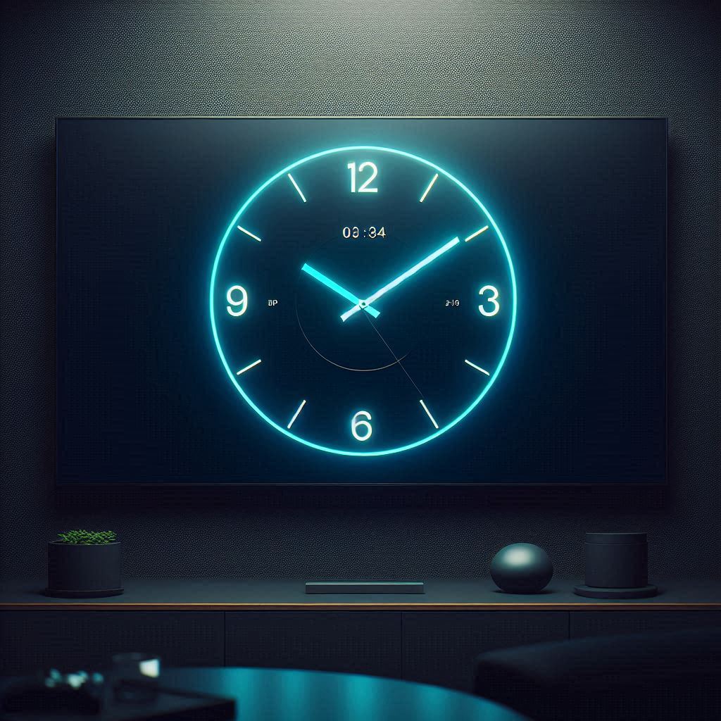
- Minimalist Digital Clock: A simple black background with bright white numerals and a subtle blue second indicator. The high contrast ensures excellent readability, while the blue accent adds a touch of visual interest.
- Analog Clock with Wooden Frame: A light cream-colored face with dark brown hands and numerals. The natural color palette complements the wooden frame, creating a warm and inviting aesthetic.
- World Clock App: Each time zone is assigned a different color, such as blue for North America, green for Europe, and orange for Asia. This makes it easy to quickly identify the time in different regions.
- Alarm Clock with Sunrise Simulation: The clock gradually transitions from dark blues and purples to bright yellows and oranges in the morning to simulate a sunrise. This helps to wake the user up gently and naturally.
Tools and Resources for Color Palette Selection
Numerous tools and resources can assist designers in creating effective color palettes:
- Adobe Color: A web-based tool that allows you to create and explore color harmonies.
- Coolors: A super-fast color scheme generator.
- Paletton: A designer tool for creating color schemes that work well together.
- Color Hunt: A curated collection of beautiful color palettes.
- Contrast Checker: Online tools to check color contrast ratios for accessibility.
- Color Blindness Simulators: Tools that allow you to simulate how a design appears to people with different types of color blindness.
Conclusion
Color is a powerful tool that can significantly enhance the usability, aesthetics, and emotional impact of clock interfaces. By understanding the fundamentals of color theory, considering cultural and personal preferences, and utilizing available tools and resources, designers can create clock designs that are not only functional but also visually appealing and engaging. From ensuring readability on TV screens across various devices (Samsung Tizen TV, LG WebOS TV, Android TV, and Amazon Fire TV) to evoking a desired mood, thoughtful color choices are essential for creating a positive user experience. So, embrace the power of color and unlock the full potential of your clock designs. Whether used as a screensaver or a primary timekeeping tool, a well-designed clock, thoughtfully colored, can enhance any digital environment. Understanding that visual information and proper design could improve usability and overall look.