Developing a Signature Clock Face for Brand Identity: Timeless Design for the Digital Age
The humble clock, a ubiquitous fixture in our lives for centuries, has evolved far beyond its original purpose. No longer simply a tool for tracking the passage of time, the modern clock – particularly in its digital form – offers a unique canvas for expressing personality, enhancing aesthetics, and even reinforcing brand identity. In a world saturated with visual noise, a carefully designed clock face can be a subtle yet powerful way to capture attention and leave a lasting impression. This article delves into the art and science of crafting a signature clock face, exploring the key elements that contribute to its effectiveness and its potential as a branding asset, especially relevant in today's world of smart TVs and digital signage.
The Enduring Appeal of Time:
Before exploring the nuances of clock face design, it's important to understand the enduring appeal of time itself. Time is a fundamental aspect of human existence, and our relationship with it is deeply ingrained. Clocks, therefore, have always held a certain fascination, representing order, progress, and even mortality. This inherent appeal provides a strong foundation for any design endeavor. Whether it's an analog clock face, a digital representation, or a more abstract interpretation of time, the core concept resonates with everyone. Consider the prevalence of clock displays on various devices, from smartphones to smart home hubs. Even in an age of ubiquitous information, people still seek a clear and readily available way to stay oriented in time.
Beyond Functionality: The Clock Face as a Visual Statement:
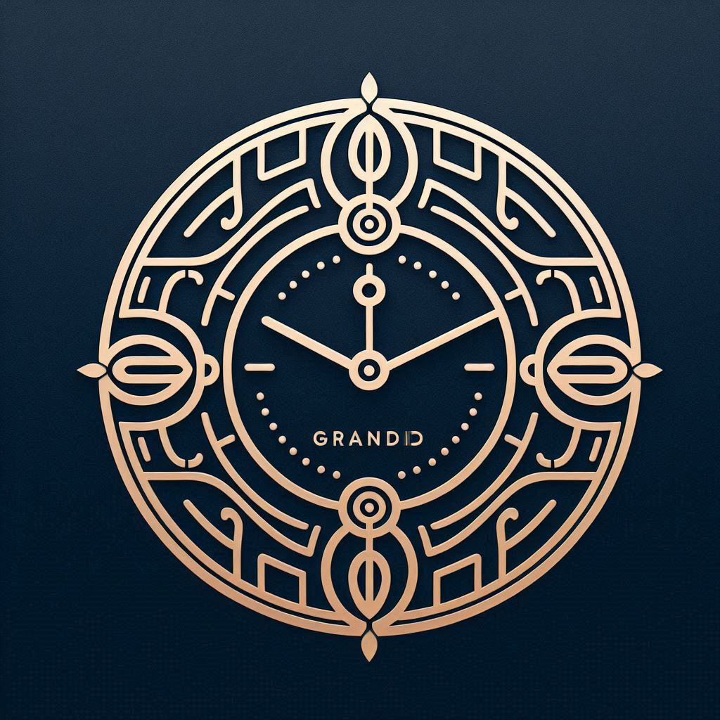
While functionality remains paramount, a clock face can be so much more than a simple display of hours and minutes. It can be a statement of style, a reflection of personal taste, or, most significantly for businesses, a reinforcement of brand identity. Think of the iconic designs of luxury watch brands – their clock faces are instantly recognizable and intrinsically linked to their brand image.
The digital realm offers even greater flexibility. Clock apps, like "clock o clock", showcase the vast possibilities of customization. From minimalist designs to intricate animations, the choices are virtually limitless. This flexibility allows designers to create clock faces that are not only functional but also visually engaging and thematically relevant.
Key Elements of a Signature Clock Face Design:
Several key elements contribute to the overall effectiveness of a clock face design:
- Typography: The font used for the numerals (or lack thereof) is crucial. A clean, modern sans-serif font might convey a sense of efficiency and innovation, while a classic serif font could evoke tradition and reliability. The choice should align with the overall brand aesthetic. Consider the readability of the font at various distances and screen sizes, especially for TV applications.
- Color Palette: Colors evoke emotions and associations. A brand's color palette should be carefully considered and integrated into the clock face design. Use colors that are consistent with the brand's overall visual identity and that enhance readability. Consider the impact of different color combinations on visibility in various lighting conditions. Accessibility considerations are paramount; ensure sufficient contrast for users with visual impairments.
- Imagery and Graphics: Subtle use of imagery or graphics can add depth and visual interest. This could include a brand's logo, a subtle pattern, or an abstract design element. The key is to avoid cluttering the display and ensuring that the imagery complements the overall design. Consider using vector graphics for scalability and sharpness across different screen resolutions.
- Layout and Composition: The arrangement of elements on the clock face is critical. A well-balanced and visually appealing layout will make the clock easier to read and more enjoyable to look at. Consider using the principles of visual hierarchy to guide the viewer's eye and emphasize important information.
- Motion and Animation: In the digital realm, motion and animation can add a dynamic element to the clock face. A subtle ticking animation, a sweeping second hand, or a changing background can make the clock more engaging. However, it's important to avoid excessive animation that could be distracting or energy-intensive.
Integrating Brand Identity into a Clock Face:
The true power of a signature clock face lies in its ability to seamlessly integrate with a brand's identity. Here's how to achieve this:
- Understand the Brand's Essence: Before starting the design process, it's crucial to have a deep understanding of the brand's core values, target audience, and overall message. What emotions does the brand want to evoke? What are its key differentiators? The clock face design should reflect these elements.
- Incorporate Brand Colors and Fonts: Use the brand's official color palette and fonts in the clock face design. This will create a sense of consistency and reinforce brand recognition. Ensure that the colors and fonts are legible and visually appealing on the target display.
- Subtly Integrate the Logo: A logo can be integrated into the clock face in a subtle and tasteful way. Avoid making the logo too prominent, as it could distract from the primary function of displaying the time. Consider using a watermark or a small, stylized version of the logo.
- Create a Unique Visual Language: Develop a visual language that is consistent with the brand's overall aesthetic. This could include using specific shapes, patterns, or textures that are associated with the brand.
- Consider the Context: Think about where the clock face will be displayed and how it will be used. A clock face designed for a smart TV in a living room will likely be different from one designed for a digital sign in a retail store. Optimize the design for the specific viewing distance and lighting conditions.
Clock Faces for Different Platforms: Adapting to the Digital Landscape
The implementation of a clock face design will vary depending on the platform it will be used on. Let's examine some key considerations for different platforms:
- Smart TVs (Samsung Tizen TV, LG WebOS TV, Android TV, Amazon Fire TV): Smart TVs present a unique opportunity for clock face integration. These devices are often used as ambient displays, screensavers, or background displays. Clock apps, such as "clock o clock", are gaining popularity, offering users a variety of customizable clock faces to enhance their viewing experience.
- Resolution and Scalability: Smart TVs come in a variety of screen sizes and resolutions. Ensure that the clock face design is scalable and looks sharp on all devices. Use vector graphics and high-resolution assets to avoid pixelation.
- Remote Control Navigation: Consider how users will interact with the clock app using a remote control. Make the interface intuitive and easy to navigate.
- Energy Efficiency: Optimize the clock face design for energy efficiency, especially if it will be used as a screensaver. Avoid excessive animation and use dark backgrounds to reduce power consumption.
- Platform Specific Guidelines: Adhere to the specific design guidelines for each smart TV platform (Samsung Tizen TV, LG WebOS TV, Android TV, Amazon Fire TV). This will ensure that the clock app is compatible and optimized for the platform.
- Mobile Devices (Smartphones and Tablets): Clock faces on mobile devices are typically smaller and more intimate. Prioritize readability and ease of use.
- Touchscreen Optimization: Design the clock face for touchscreen interaction. Make the elements large enough to be easily tapped and consider using gestures for navigation.
- Battery Life: Optimize the clock face for battery life. Avoid excessive animation and use dark themes to reduce power consumption on OLED screens.
- Notifications: Integrate notifications into the clock face in a subtle and unobtrusive way.
- Websites and Digital Signage: Clock faces can also be used on websites and digital signage. In these contexts, the clock face should be visually appealing and consistent with the overall brand identity.
- Responsiveness: Ensure that the clock face is responsive and adapts to different screen sizes.
- Performance: Optimize the clock face for performance, especially on websites. Avoid using excessive animation or large images that could slow down the page load time.
- Accessibility: Ensure that the clock face is accessible to users with disabilities. Provide sufficient contrast and alternative text for images.
The Importance of User Experience (UX) in Clock Face Design:
While aesthetics are important, the user experience should always be a top priority. A beautiful clock face is useless if it's difficult to read or navigate.
- Readability: The clock face should be easy to read at a glance. Use clear fonts, high contrast, and a well-balanced layout.
- Usability: The clock face should be intuitive and easy to use. Users should be able to quickly access the information they need.
- Customization: Allow users to customize the clock face to their liking. This could include changing the colors, fonts, and layout. Apps like "clock o clock" on various TV platforms provide this customization which is a huge benefit for the user.
- Performance: The clock face should be fast and responsive. Avoid using excessive animation or large images that could slow down the performance.
- Accessibility: The clock face should be accessible to users with disabilities. Provide sufficient contrast, alternative text for images, and keyboard navigation.
Clock Faces as Screensavers: A Subtle Branding Opportunity:
Using a branded clock face as a screensaver is a subtle yet effective way to reinforce brand identity. When a device is idle, the clock face can serve as a constant reminder of the brand. This is particularly relevant for smart TVs, which are often left on in the background.
- Non-Intrusive Design: The screensaver should be non-intrusive and visually appealing. Avoid using overly bright colors or distracting animations.
- Subtle Branding: The branding should be subtle and tasteful. Avoid making the logo too prominent or using aggressive marketing messages.
- Energy Efficiency: The screensaver should be energy efficient to avoid draining the battery or wasting electricity.
- Customization Options: Provide users with options to customize the screensaver to their liking. This could include changing the colors, fonts, and layout.
The Future of Clock Face Design:
Clock face design is constantly evolving, driven by technological advancements and changing user expectations. Here are some trends to watch out for:
- Personalization: Clock faces will become increasingly personalized, adapting to the user's preferences and habits. AI-powered clock faces could learn from the user's schedule and provide relevant information, such as upcoming meetings or weather forecasts.
- Interactive Clock Faces: Clock faces will become more interactive, allowing users to perform tasks directly from the clock display. For example, users could set alarms, check their email, or control their smart home devices.
- Augmented Reality (AR) Clock Faces: AR technology could be used to create immersive clock face experiences. Users could point their smartphone at a wall and see a virtual clock projected onto the surface.
- Integration with the Internet of Things (IoT): Clock faces will become increasingly integrated with the IoT, providing users with access to real-time data from various sensors and devices. For example, a clock face could display the temperature, air quality, or energy consumption of a building.
- Focus on Wellness: Clock faces may incorporate features that promote wellness, such as reminders to take breaks, drink water, or practice mindfulness.
Conclusion: The Timeless Value of a Well-Designed Clock Face
In a world of constant digital distraction, a well-designed clock face can offer a moment of clarity and connection. More than just a functional tool, it can be a subtle expression of personality, a reinforcement of brand identity, and a window into the evolving relationship between humans and time. By carefully considering the elements of typography, color, imagery, layout, and motion, designers can create clock faces that are not only visually appealing but also meaningful and enduring. Whether it's a sleek digital display on a smart TV or a classic analog face on a wristwatch, the clock remains a timeless symbol of our shared human experience. And for brands, the clock face represents a unique opportunity to subtly weave themselves into the fabric of everyday life, reminding consumers of their presence with every passing second. Developing apps that allow the user to customize their own clock faces like "clock o clock" and tailoring the look to the brand makes it invaluable.