The Impact of Texture and Material Design in Clock UIs
The modern clock, especially in its digital form, is far more than a mere time-telling device. It's a design element, a functional piece of art, and a subtle reflection of our personal aesthetic. Nowhere is this truer than in the realm of clock UIs, particularly on larger displays like TVs where the clock might double as a screensaver. Incorporating thoughtful textures and adhering to the principles of material design can transform a simple time display into a captivating and engaging visual experience. This article will explore how these elements can elevate the humble clock UI, adding depth, realism, and a touch of sophistication.
The Allure of Texture:
In the physical world, texture is a crucial part of how we perceive objects. It engages our sense of touch, adding another layer of information beyond visual cues. While we can't physically feel a digital clock face, the illusion of texture can have a powerful impact.
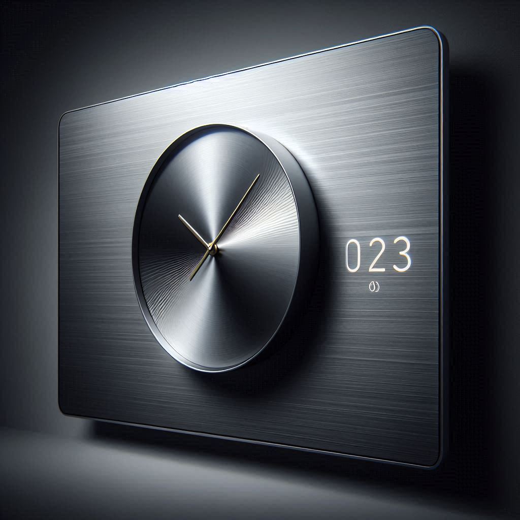
Brushed Metal: A brushed metal texture evokes a sense of quality, durability, and precision. It subtly catches the light, creating variations in tone that add visual interest. Think of classic wristwatches – the subtle glint of brushed stainless steel is often associated with high-end timepieces. A clock o clock UI incorporating this texture can bring a similar sense of refinement to your living room. The design can be sleek, sophisticated, and professional. A good implementation will carefully consider how light interacts with the texture to ensure it looks realistic without being distracting.
Wood Grain: Wood grain brings warmth, naturalness, and a touch of rustic charm. Different wood types (oak, walnut, cherry) offer distinct visual characteristics. A wooden clock face can create a cozy and inviting atmosphere, especially appealing in a living room setting. A carefully chosen wood texture can complement a wide range of interior design styles, from traditional to modern farmhouse.
Paper-Like Finishes: A paper-like texture can lend a sense of softness and simplicity. Think of the look and feel of high-quality paper or card stock. This approach can be particularly effective for minimalist clock designs. The subtle texture adds visual interest without overwhelming the display, creating a clean and understated aesthetic.
Stone and Concrete: Textures like stone or concrete can impart a sense of solidity, permanence, and industrial chic. These textures often feature subtle variations in color and pattern, adding a unique character to the clock face. A concrete texture might work well in a modern, minimalist space, while a stone texture could evoke a sense of history and tradition.
Fabric Textures: For softer, more playful designs, consider fabric textures like linen or tweed. These can add a touch of warmth and personality to the clock UI. A linen texture, for example, might be appropriate for a clock face with a handwritten-style font, creating a casual and inviting feel.
Beyond Realism: Texture doesn't always have to be realistic. Abstract textures, patterns, and gradients can also be used to create visually interesting clock faces. Consider using subtle noise patterns, geometric textures, or even animated textures to add a dynamic element to the clock display.
Material Design Principles in Clock UIs:
Material Design, Google's design language, emphasizes creating user interfaces that are visually appealing, intuitive, and consistent across different platforms. It’s based on the metaphor of paper and ink, with elements casting shadows and layering on top of each other to create a sense of depth.
Depth and Shadow: The use of subtle shadows is a key element of Material Design. Applying shadows to clock hands, numerals, and other UI elements can create a sense of depth and hierarchy, making the clock face easier to read and understand. Shadows also add a touch of realism, mimicking the way light interacts with physical objects.
Color Palette: Material Design recommends using a limited and harmonious color palette. Choose colors that are visually appealing and appropriate for the intended use of the clock. Consider using accent colors to highlight important information, such as the current time or date. Accessibility is crucial – ensure sufficient contrast between text and background colors to make the clock face easy to read for everyone. The "clock o clock" app leverages this by allowing extensive color customization.
Typography: Choose fonts that are legible, visually appealing, and consistent with the overall design. Material Design recommends using a combination of font weights and sizes to create a clear visual hierarchy. Avoid using overly decorative fonts that can be difficult to read, especially on smaller screens or from a distance.
Motion and Animation: Subtle animations can be used to enhance the user experience and provide visual feedback. For example, the clock hands could move with a smooth, fluid animation. Transitions between different clock faces or settings should be seamless and visually appealing. Avoid using excessive or distracting animations that can detract from the primary function of the clock.
Responsiveness: A well-designed clock UI should be responsive, adapting to different screen sizes and resolutions. The layout and elements should scale appropriately to ensure that the clock remains legible and visually appealing on both small and large displays. This is especially important for a TV clock app, where the screen size can vary significantly.
Consistency: Maintain consistency in the design language throughout the clock UI. Use the same fonts, colors, and styles across all screens and elements. This will create a cohesive and intuitive user experience.
Applying Texture and Material Design to Clock o clock:
Imagine the possibilities for a TV clock app like clock o clock. By offering a wide range of customizable clock faces with different textures and incorporating Material Design principles, the app can cater to a diverse range of user preferences and design styles.
Customization Options: Provide users with the ability to customize the texture, color, font, and other elements of the clock face. This will allow them to create a clock that perfectly matches their personal aesthetic and the decor of their living room.
Pre-Designed Themes: Offer a selection of pre-designed themes that incorporate different textures and Material Design principles. These themes can serve as a starting point for users who want to quickly create a visually appealing clock face. Themes could include:
- Minimalist Metal: A clean and modern design with a brushed metal texture and a simple, sans-serif font.
- Rustic Wood: A warm and inviting design with a wood grain texture and a classic, serif font.
- Paper White: A soft and understated design with a paper-like texture and a handwritten-style font.
- Industrial Chic: A bold and edgy design with a concrete texture and a geometric font.
- Retro Digital: A design evoking the look of classic digital displays, perhaps with a segmented LED-style font and subtle scanlines.
Ambient Mode Integration: Leverage the ambient mode capabilities of TV platforms (like those found on Android TV and newer Samsung and LG models) to create a clock face that blends seamlessly into the background when the TV is not in active use. This can create a more subtle and less distracting visual experience.
Screensaver Functionality: A well-designed clock UI can also serve as an engaging screensaver. Consider incorporating subtle animations or dynamic elements to keep the display visually interesting.
The Psychology Behind Visual Appeal:
The impact of texture and design extends beyond mere aesthetics. They touch upon psychological principles that affect our perception and enjoyment of the product.
Emotional Connection: Textures can evoke emotions and associations. Wood grain can bring feelings of warmth and nostalgia, while metal can convey modernity and efficiency. Using textures thoughtfully can forge a stronger emotional connection between the user and the clock.
Perceived Value: A well-designed clock UI with high-quality textures can increase the perceived value of the app. Users are more likely to appreciate and use an app that looks and feels polished.
Reduced Eye Strain: Properly implemented textures and shadows can make a clock face easier to read, reducing eye strain, especially during extended viewing periods.
Brand Identity: The design of the clock UI can contribute to the overall brand identity of the app. A consistent and visually appealing design can help to differentiate the app from its competitors.
Technical Considerations:
Implementing textures and Material Design principles effectively requires careful attention to technical details.
Image Resolution: Use high-resolution textures to ensure that the clock face looks crisp and clear on large displays.
Performance Optimization: Optimize the performance of the clock UI to prevent lag or slowdown, especially on older TV models.
Platform Compatibility: Ensure that the clock UI is compatible with different TV platforms and screen resolutions.
Accessibility: Adhere to accessibility guidelines to ensure that the clock face is usable by people with visual impairments.
File Size: Keep the overall file size of the app as small as possible to minimize download times and storage requirements. This might involve optimizing textures and using efficient image formats.
Beyond Timekeeping: The Clock as Art:
Ultimately, the clock UI has the potential to be more than just a functional tool. It can be a work of art, a reflection of personal style, and a subtle enhancement to the living space. By embracing the power of texture and Material Design, developers can transform the humble clock into a captivating and engaging visual experience. A well-designed clock UI can add a touch of sophistication, warmth, or whimsy to any room, making the simple act of checking the time a more enjoyable experience. The possibilities for clock o clock are endless, offering a canvas for creativity and personalization. As technology continues to evolve, the clock will undoubtedly continue to reinvent itself, adapting to new platforms and embracing new design trends. The future of clock UIs is bright, promising a world of visually stunning and functionally innovative timekeeping experiences.