Adapting Clock Designs for Dark Mode: A Comprehensive Guide
The Rise of Dark Mode and Its Impact on UI/UX
Dark mode, also known as night mode, has exploded in popularity across various platforms, from smartphones and tablets to desktop operating systems and, increasingly, TV applications. The appeal is multifaceted. For one, it's often touted for reducing eye strain, especially in low-light environments. The lower blue light emission can also contribute to better sleep patterns for some users. Beyond the health benefits, dark mode offers a sleek, modern aesthetic that many find visually appealing. This trend extends to TV environments where users enjoy consuming content in dimly lit rooms. For app developers, especially those designing user interfaces (UI) for clock applications that might be used as screensavers or background displays, understanding how to effectively adapt designs for dark mode is crucial.
Understanding the Challenges of Dark Mode Clock Design
Simply inverting colors from a light theme to a dark theme rarely produces optimal results. Dark mode presents unique challenges that require careful consideration:
- Readability: Text that looks crisp and clear on a light background can become blurry or indistinct on a dark background, especially with smaller font sizes.
- Contrast: While dark mode inherently involves higher contrast ratios, finding the right level of contrast is key. Excessive contrast can be jarring and lead to eye fatigue, while insufficient contrast makes elements difficult to discern.
- Color Perception: Colors are perceived differently against dark backgrounds compared to light backgrounds. What appears vibrant and balanced in a light theme might appear washed out or garish in a dark theme.
- Glare and Blooming: Bright elements against a dark background can create glare and "blooming" effects on some displays, where the light appears to bleed into surrounding dark areas. This is particularly noticeable on OLED screens and some TV displays.
- Visual Hierarchy: Dark mode can alter the visual hierarchy of elements within the interface. Careful attention needs to be paid to ensure that important information remains easily accessible and that the user's eye is drawn to the right places.
Key Considerations for Adapting Clock Faces for Dark Mode
Here's a detailed guide to help you create effective and visually appealing clock designs for dark mode:
1. Choosing the Right Color Palette
Embrace Neutrals: Start with a foundation of neutral grays and blacks. Instead of pure black (#000000), consider using slightly lighter shades like #121212 or #1E1E1E. These softer blacks can reduce the harshness and perceived glare. Similarly, avoid pure white (#FFFFFF) for text and other UI elements. Opt for off-white shades like #F0F0F0 or #E0E0E0.
Accent Colors Judiciously: Use accent colors sparingly to highlight key information like the time, date, or specific indicators. Choose colors that complement the dark background and provide sufficient contrast without being overwhelming. Muted tones and pastel shades often work well. Avoid highly saturated colors, as they can be too intense against a dark backdrop.
Color Harmony: Maintain a consistent color palette throughout the clock face. Use color theory principles (e.g., complementary colors, analogous colors) to create visually pleasing combinations. Tools like Adobe Color or Coolors.co can help you generate harmonious color palettes.
Accessibility: Ensure sufficient color contrast between text and background elements to meet accessibility standards (WCAG). Use contrast checker tools to verify that the contrast ratio is at least 4.5:1 for normal text and 3:1 for large text. This is critical for users with visual impairments.
Theming Options: Consider providing users with options to customize the color palette to their preferences. This is especially valuable for a TV clock app intended for prolonged use as a screensaver. Allow users to select from a range of pre-defined themes or create their own custom themes.
2. Optimizing Contrast Levels
Experiment with Different Contrast Ratios: Don't assume that maximum contrast is always best. Experiment with slightly lower contrast ratios to reduce eye strain. A contrast ratio of around 7:1 to 10:1 can often be a good starting point.
Use Layering and Shadows: Subtle shadows and layering effects can help to create visual separation between elements and improve readability. Use them sparingly to avoid cluttering the interface. A very subtle drop shadow behind the clock numbers can enhance their visibility.
Avoid Overly Bright Elements: Large areas of bright white or highly saturated colors can be distracting and cause glare. Break up these areas with darker tones or gradients.
Test on Different Displays: Contrast perception can vary significantly depending on the display technology (e.g., OLED, LCD). Test your designs on a variety of devices to ensure that they look good across different screen types. This is especially important for apps that target the TV market.
3. Typography for Dark Mode
Choose Clear and Readable Fonts: Select fonts that are designed for screen readability. Avoid overly decorative or condensed fonts, as they can be difficult to read in dark mode. Sans-serif fonts generally work well, but some serif fonts can also be effective if they have good legibility. Popular choices include Roboto, Open Sans, Lato, and Montserrat.
Adjust Font Weights: Consider using slightly heavier font weights for text in dark mode to improve its visibility. However, avoid going too bold, as this can make the text appear too thick and overwhelming.
Optimize Font Size: Ensure that the font size is large enough to be easily readable on the target devices, especially on TVs viewed from a distance.
Line Height and Letter Spacing: Increase the line height (leading) and letter spacing (tracking) slightly to improve readability. This can help to prevent the letters from running together and make the text feel more spacious.
Anti-aliasing and Subpixel Rendering: Ensure that anti-aliasing and subpixel rendering are enabled to smooth the edges of the text and improve its clarity.
4. Implementing Subtle Effects
Glow Effects: A subtle glow effect can add a touch of elegance to the clock face and make the numbers stand out against the dark background. Use a soft, diffused glow with a low opacity.
Gradient Overlays: Gradients can be used to create depth and visual interest. Use subtle gradients with muted colors to avoid overwhelming the interface.
Parallax Effects: Subtle parallax effects can add a sense of depth and dynamism to the clock face. However, avoid using excessive parallax, as this can be distracting.
Subtle Animations: Consider adding subtle animations to the clock hands or other elements to make the clock feel more alive. Ensure that the animations are smooth and not too jarring.
5. Accessibility Considerations
Keyboard Navigation: Ensure that all interactive elements of the clock face can be accessed and controlled using a keyboard or remote control. This is particularly important for TV apps.
Screen Reader Compatibility: Make sure that the clock face is compatible with screen readers, so that users with visual impairments can understand the current time and date. Provide alternative text descriptions for all graphical elements.
Customizable Text Size: Allow users to adjust the text size to their preferences. This is especially important for users with low vision.
High Contrast Mode: Consider providing a high contrast mode option that further increases the contrast between text and background elements.
6. Testing and Iteration
User Testing: Conduct user testing with a diverse group of users to gather feedback on the usability and visual appeal of your clock designs. Pay close attention to their comments on readability, contrast, and eye strain.
A/B Testing: Use A/B testing to compare different design variations and identify which ones perform best.
Continuous Iteration: Dark mode design is an iterative process. Be prepared to make adjustments based on user feedback and testing results.
Specific Considerations for TV Clock Apps (e.g., clock o clock on Tizen TV, LG WebOS TV, Android TV, and Amazon Fire TV)
Designing clock faces for TV apps presents unique challenges and opportunities:
- Viewing Distance: TV screens are typically viewed from a greater distance than computer monitors or mobile devices. This means that text and UI elements need to be larger and more readable.
- Screen Resolution: TV screens come in a variety of resolutions, from HD to 4K and even 8K. Ensure that your clock designs scale well across different resolutions.
- Remote Control Interaction: Users will typically interact with the clock app using a remote control, which can be less precise than a mouse or touchscreen. Design the interface to be easy to navigate and use with a remote.
- Screensaver Functionality: Many TV clock apps are used as screensavers, so it's important to design clock faces that are visually appealing and don't cause screen burn-in. Consider using elements that move around the screen periodically to prevent static images from being displayed for too long.
- Performance Optimization: TV devices often have limited processing power, so it's important to optimize the performance of your clock app to ensure smooth animations and transitions.
- Platform-Specific Guidelines: Each TV platform (e.g., Tizen, WebOS, Android TV, Fire TV) has its own design guidelines and best practices. Be sure to familiarize yourself with these guidelines and follow them when designing your clock faces. For example, Samsung Tizen TV and LG WebOS TV have specific requirements for app icons and app store listings.
- Ambient Mode Integration: Some TVs offer an ambient mode that displays information such as the time and weather when the TV is not actively being used. Consider integrating your clock app with the ambient mode to provide a seamless user experience.
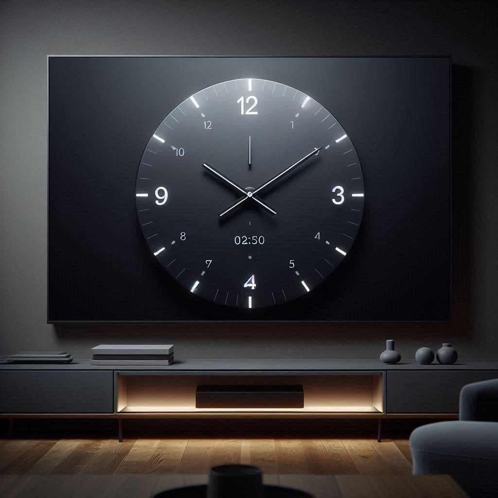
Example: Transforming a Light Clock Face to Dark Mode
Let's say you have a simple analog clock face with a white background and black hands and numbers. Here's how you might adapt it for dark mode:
- Background: Replace the white background with a dark gray or black color.
- Hands and Numbers: Change the black hands and numbers to a light gray or off-white color.
- Dial Markers: If the clock face has dial markers, reduce their opacity or change their color to a lighter shade of gray.
- Shadows: Add a subtle drop shadow behind the hands and numbers to make them stand out against the dark background.
- Glow: Consider adding a subtle glow effect around the hands and numbers.
Tools and Resources
- Color Palette Generators: Adobe Color, Coolors.co, Paletton
- Contrast Checker Tools: WebAIM Contrast Checker, Accessible Colors
- UI Design Software: Adobe XD, Figma, Sketch
- TV Platform Developer Documentation: Samsung Developers (Tizen), LG Developer (WebOS), Android Developers (Android TV), Amazon Developer (Fire TV)
Conclusion
Adapting clock designs for dark mode requires a thoughtful approach that takes into account the unique challenges and opportunities of this popular UI trend. By carefully considering color schemes, contrast levels, typography, and accessibility, you can create clock faces that are not only visually appealing but also easy to read and comfortable to use, especially on devices like TVs where clock applications serve as screensavers. Remember to test your designs thoroughly and iterate based on user feedback to ensure that you are creating the best possible experience. As platforms like Samsung Tizen TV, LG WebOS TV, Android TV, and Amazon Fire TV continue to embrace dark mode, the ability to design effective and stylish clock faces for these environments will become increasingly valuable, enhancing the overall user experience, particularly for apps like clock o clock.