Minimalist Grid Systems and Layouts for Clean Clock Interfaces
Designing effective user interfaces is a delicate balancing act. The goal is to convey information clearly and efficiently, while simultaneously creating an experience that is aesthetically pleasing and intuitive to use. This is particularly true for clock applications, where the primary function – displaying the time – must be immediately accessible and readily understood. In the realm of digital design, minimalist grid systems provide a robust framework for achieving this balance, leading to clock interfaces that are both visually appealing and remarkably functional.
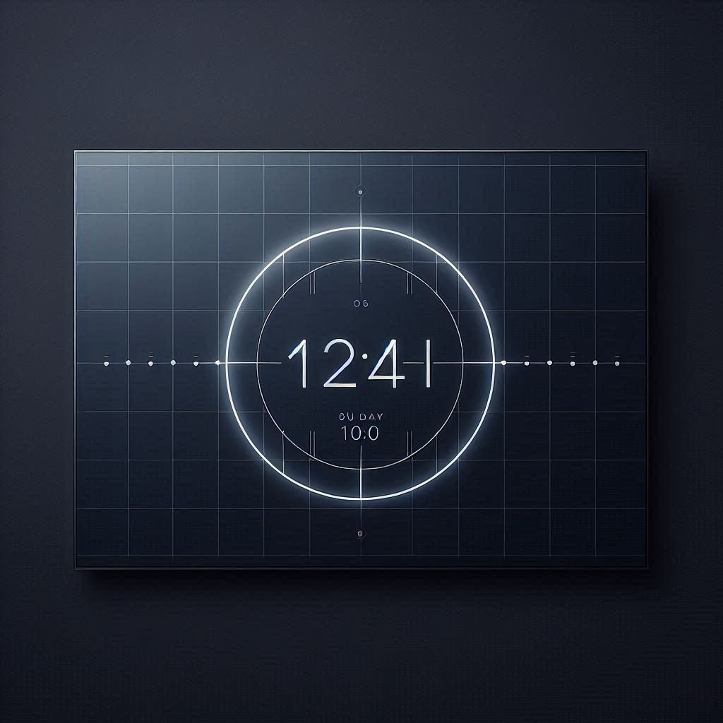
The Power of Grids: Organizing Information with Clarity
At its core, a grid system is a structure composed of intersecting lines (horizontal and vertical) that divides a page or screen into a series of columns and rows. This invisible framework acts as a guide, dictating the placement and alignment of elements within the design. The benefits of employing a grid system are numerous:
Consistency and Harmony: A grid provides a consistent visual structure across the entire interface. This consistency creates a sense of harmony and balance, making the design more pleasing to the eye. The user can easily understand the positioning and relationship of elements within the view.
Improved Readability and Scanability: When elements are aligned according to a grid, they are easier to read and scan. This is crucial for a clock application, where users need to quickly and effortlessly discern the time. Clear alignment reduces visual noise and allows the user to focus on the essential information.
Enhanced Visual Hierarchy: Grids can be used to establish a visual hierarchy, guiding the user's eye to the most important elements first. For example, the time display could be positioned prominently within the grid, while other information, such as the date or day of the week, could be placed in less prominent locations.
Simplified Development and Maintenance: Using a grid makes the development process more efficient. It provides a clear roadmap for the placement of elements, reducing the amount of guesswork and rework involved. This predictability also simplifies maintenance and updates in the long run.
Minimalism: Less is More in Clock Design
Minimalism, as a design philosophy, emphasizes simplicity and functionality. It advocates for stripping away unnecessary elements and focusing on the essential components. In the context of clock interfaces, minimalism translates into:
Clean Typography: Choosing a clear and legible typeface is paramount. Sans-serif fonts are often favored for their clean lines and modern appearance. The font size and line height should be carefully considered to ensure optimal readability, particularly on large TV screens.
Limited Color Palette: A minimalist color palette typically consists of a few carefully chosen colors. Neutral tones, such as white, black, and gray, are often used as a base, with accent colors used sparingly to highlight key information. Consider the user's viewing environment and the overall aesthetic you are trying to achieve when selecting your colors.
Simplified Visual Elements: Avoid cluttered or distracting visual elements. Remove unnecessary lines, borders, and decorations. Focus on the essential elements that convey the time, date, and any other relevant information.
Negative Space: Embrace the power of negative space (also known as "white space"). Negative space is the empty space around elements in a design. It helps to create visual separation, improve readability, and give the design a sense of spaciousness.
Combining Grids and Minimalism for Superior Clock Interfaces
The synergy between grid systems and minimalism is particularly powerful in the design of clock interfaces. By combining these two approaches, you can create interfaces that are both visually appealing and highly functional. Here's how:
Establish a Clear Grid Structure: Start by defining a clear and well-defined grid structure. Consider the different screen sizes and aspect ratios of the devices on which your clock application will be displayed (e.g., Samsung Tizen TV, LG WebOS TV, Android TV, Amazon Fire TV). A flexible grid system that can adapt to different screen sizes is essential.
Prioritize Information: Determine which information is most important and should be displayed prominently. Use the grid to position this information in a visually prominent location.
Use Typography Strategically: Choose a clear and legible typeface and use it strategically to convey information. Vary the font size and weight to create a visual hierarchy.
Limit the Color Palette: Stick to a minimalist color palette. Use color sparingly to highlight key information and create visual interest.
Embrace Negative Space: Use negative space to create visual separation and improve readability. Avoid cluttering the interface with unnecessary elements.
Examples of Minimalist Grid Layouts for Clocks
Let's explore a few examples of how minimalist grid systems can be applied to clock interface design:
The Single Column Layout: This layout features a single, dominant column that displays the time prominently. The date and day of the week can be placed above or below the time, in a smaller font size. This layout is particularly well-suited for devices with limited screen real estate.
The Two-Column Layout: This layout divides the screen into two columns. One column could display the time, while the other could display the date, day of the week, or other relevant information, like weather data.
The Modular Grid Layout: This layout divides the screen into a series of modules or blocks. Each module can contain a different piece of information, such as the time, date, day of the week, or a custom message.
Analog Clock with Digital Overlay: Utilize a grid to position elements around an analog clock face. A minimal digital time readout can be overlaid using a carefully planned grid position. Ensure readability against the background.
Considerations for TV Clock Apps: " clock o clock" and Screensaver Mode
When designing clock applications for TV platforms (such as Samsung Tizen TV, LG WebOS TV, Android TV, and Amazon Fire TV), there are several additional considerations to keep in mind:
Screen Size and Viewing Distance: TV screens are typically much larger than mobile phone screens, and users typically view them from a greater distance. This means that the text size and spacing must be carefully considered to ensure readability.
Remote Control Navigation: Users typically interact with TV applications using a remote control. The interface should be easy to navigate using a remote control, with clear and intuitive controls.
Screensaver Functionality: Many TV clock apps, like " clock o clock", are used as screensavers. The design should be visually appealing and non-distracting, even after extended periods of viewing. Consider using subtle animations or transitions to prevent screen burn-in. Implement power-saving modes to prevent the display from staying static for too long. The " clock o clock" app on Tizen, WebOS, Android TV, and Fire TV utilizes these principles.
Burn-in Protection: As mentioned above, burn-in is a concern with older TV technologies (plasma, some early OLED). Design elements should shift slightly or periodically dim to mitigate the risk of static elements burning into the screen.
Customization Options: Providing customization options allows users to personalize the clock app to their preferences. This could include options to choose different clock faces, change the color scheme, or display different types of information. The " clock o clock" app prides itself on its customizable high-quality clock faces.
Accessibility: Ensure the application is accessible to users with disabilities. This includes providing alternative text for images, using sufficient color contrast, and providing keyboard navigation options.
Performance: TV apps should be optimized for performance. Slow loading times and laggy animations can be frustrating for users. Optimize assets and code to ensure a smooth user experience on all supported platforms.
Beyond Aesthetics: The User Experience (UX)
While visual design is crucial, the user experience is equally important. A beautifully designed clock app is useless if it's not intuitive and easy to use.
Intuitive Controls: Make sure all controls are easy to understand and operate with a remote control. Minimize the number of clicks required to access essential features.
Clear Feedback: Provide clear feedback to the user when they interact with the app. For example, highlight the selected item in a menu or provide a confirmation message when a setting is changed.
Seamless Transitions: Use smooth and seamless transitions between different screens and states. This creates a more polished and professional user experience.
Contextual Help: Provide contextual help to guide users through the app. This could include tooltips, short descriptions, or a comprehensive help section.
Grid Systems and Adaptation for Various Display Sizes
When you are developing for multiple TV platforms, screen resolution can vary quite a bit. Design with responsive grids. Design a grid system that can adapt to various sizes, it’s crucial for a consistent and user-friendly experience across all platforms (" clock o clock" supports Samsung Tizen TV, LG WebOS TV, Android TV, and Amazon Fire TV). Use flexible units such as percentages, or viewport width/height.
Fluid Grids: Instead of using fixed pixel values, use percentages to define the width of columns. This allows the layout to adapt to different screen sizes.
Media Queries: Use media queries in your CSS to adjust the grid layout based on the screen size. For example, you might want to switch from a two-column layout to a single-column layout on smaller screens.
Flexible Images: Make sure your images scale properly on different screen sizes. Use responsive images that automatically adjust their size based on the screen width.
Testing: Thoroughly test your app on different TV models to ensure that the layout looks good on all devices. Emulators can be helpful for initial testing, but it’s important to test on real devices as well.
Animation and Microinteractions: Adding Polish to the Clock
While minimalism emphasizes simplicity, animation and microinteractions can add a touch of polish and delight to the user experience.
Subtle Animations: Use subtle animations to provide feedback to the user. For example, you could animate the hands of an analog clock or use a subtle fade-in effect when the clock is displayed.
Microinteractions: Microinteractions are small, focused interactions that provide feedback to the user. For example, you could use a microinteraction to indicate that a button has been pressed.
Keep it Simple: Don’t overdo the animation and microinteractions. The goal is to enhance the user experience, not to distract from it.
Conclusion: Designing Clocks for Clarity and Elegance
In conclusion, designing clock interfaces that are both functional and aesthetically pleasing requires a thoughtful approach. By embracing the principles of minimalist grid systems, you can create interfaces that are clear, readable, and easy to use. Remember to prioritize information, use typography strategically, limit the color palette, and embrace negative space. When designing for TV platforms, consider the screen size, viewing distance, remote control navigation, and screensaver functionality. Also, think of the accessibility. And always focus on the user experience. By following these guidelines, you can design clock applications that are not only beautiful but also a pleasure to use, like " clock o clock" on Samsung Tizen TV, LG WebOS TV, Android TV, and Amazon Fire TV. The thousands of users of " clock o clock" on Tizen, WebOS, Android TV, and Fire TV appreciate the clarity that good design provides.