The Timeless Language: Iconography in Modern Clock App Design
The Ubiquitous Clock and Its Digital Evolution
For millennia, the clock has been an ever-present fixture in human life. From sundials casting shadows on ancient stones to the intricate gears of grandfather clocks, and now to the sleek displays of our televisions and mobile devices, the concept of timekeeping has continually adapted to reflect our evolving world. And with that evolution, the way we interact with timekeeping has also undergone a significant transformation. Nowhere is this more evident than in the design of clock applications for platforms like Samsung Tizen TV, LG WebOS TV, Android TV, and Amazon Fire TV. These apps, often serving as elegant screensavers or powerful alarm tools, rely heavily on a silent language to communicate their function: iconography.
What is Iconography, and Why Does it Matter?
Iconography, simply put, is the use of visual symbols and icons to represent ideas, concepts, or functions. In the realm of user interface (UI) and user experience (UX) design, icons are the visual shorthand that allows users to quickly understand and interact with an application without needing to read lengthy instructions or decipher complex interfaces. A well-designed icon can transcend language barriers and instantly convey meaning, making the user experience more intuitive and efficient.
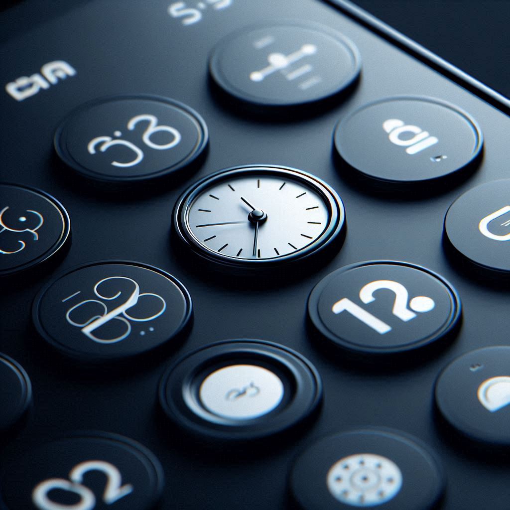
Consider a basic clock app. It presents the time, of course, but it also typically includes features like alarms, timers, stopwatches, and settings. Each of these functions can be easily and immediately accessible through the use of appropriate icons. A bell icon for alarms, a stopwatch icon for the stopwatch function, and a gear icon for settings are all examples of universally understood visual cues.
The Functional Power of Icons in Clock Apps
The primary function of any clock app, whether on a TV or a mobile device, is to help users manage their time effectively. Icons play a crucial role in achieving this goal by:
Enhancing Discoverability: Clear and recognizable icons make it easier for users to find and use the various features of the clock app. A user glancing at a clock o clock interface should be able to instantly identify the timer controls, or other relevant functions.
Improving Usability: Well-designed icons can simplify complex tasks. For example, an alarm setting interface might use icons to represent different alarm tones, repeat options (e.g., weekdays only), or snooze durations. These visual cues allow users to quickly configure their alarms without having to navigate through menus or read lengthy explanations.
Reducing Cognitive Load: By representing functions visually, icons reduce the cognitive load on the user. Instead of having to remember the names of different features or functions, users can simply rely on the visual cues provided by the icons. This is especially important on TV platforms, where users may be further away from the screen and interacting with the interface using a remote control. Reducing the need to read small text and navigate complex menus results in a more enjoyable and accessible user experience.
Providing Feedback: Icons can also be used to provide visual feedback to the user. For example, the alarm icon might change its appearance when an alarm is set or when the alarm is snoozed. This immediate visual feedback helps the user understand the current state of the application and take appropriate action.
Aesthetics and Iconography: More Than Just Function
While functionality is paramount, the aesthetic appeal of a clock app also plays a significant role in user satisfaction. Users are more likely to use and enjoy an app that is visually pleasing and well-designed. Icons contribute significantly to the overall aesthetics of a clock app in several ways:
Creating a Consistent Visual Style: Icons can be designed to match the overall visual style of the app, creating a cohesive and harmonious user interface. Whether the app adopts a minimalist, modern aesthetic or a more classic, traditional look, the icons should complement the overall design.
Adding Visual Interest: Well-designed icons can add visual interest to the app and make it more engaging to use. A clock app with plain, generic icons can feel bland and uninspired, while an app with carefully crafted, visually appealing icons can be much more enjoyable to interact with.
Communicating Brand Identity: Icons can also be used to communicate the brand identity of the clock app. The choice of colors, shapes, and styles used in the icons can reflect the overall brand image and help to create a consistent brand experience across all platforms. The design of the icons could even subtly reinforce the app's name, "clock o clock," through visual puns or clever design elements.
Designing Effective Icons: Key Considerations
Creating effective icons for a clock app requires careful consideration of several factors:
Clarity and Recognizability: The most important characteristic of an icon is its clarity and recognizability. Users should be able to understand the meaning of the icon at a glance, without needing to guess or decipher its meaning. This often involves using universally understood symbols and metaphors.
Consistency: It is important to maintain consistency in the style and design of the icons throughout the app. This helps to create a cohesive visual experience and makes it easier for users to learn and remember the meaning of each icon.
Scalability: Icons should be designed to scale well to different screen sizes and resolutions. This is especially important for clock apps that are intended to be used on both mobile devices and TV platforms, where screen sizes can vary significantly. SVG (Scalable Vector Graphics) is a popular format for icons as they can be scaled without losing quality.
Accessibility: Icons should be designed with accessibility in mind. This means ensuring that the icons are easy to see and understand, even for users with visual impairments. Using sufficient contrast between the icon and the background, and providing alternative text descriptions for each icon, can improve accessibility.
Platform-Specific Guidelines: Different platforms, such as Samsung Tizen TV, LG WebOS TV, Android TV, and Amazon Fire TV, may have specific guidelines for icon design. It is important to adhere to these guidelines to ensure that the icons look and function correctly on each platform. This includes considering aspects like icon size, shape, and color palette, as well as any specific requirements for animation or interaction.
The Challenge of Customization: Allowing User Choice
Many clock apps, including those with a significant presence on TV platforms, offer users the ability to customize the appearance of the app, including the clock faces and the icons. This presents a unique design challenge: how to allow users to customize the icons without compromising their clarity or recognizability.
One approach is to provide users with a selection of pre-designed icon sets, each with a different style or theme. This allows users to choose icons that match their personal preferences while ensuring that the icons remain consistent and functional. Another approach is to allow users to customize the colors or shapes of the icons, while still maintaining their basic form and structure.
The key is to strike a balance between allowing users to express their individuality and ensuring that the icons remain clear, recognizable, and consistent. This requires careful planning and a deep understanding of the principles of icon design.
The Future of Iconography in Clock Apps
As technology continues to evolve, the role of iconography in clock apps is likely to become even more important. With the rise of voice-controlled interfaces and gesture-based interactions, icons may become the primary means of interacting with the app.
Furthermore, the increasing sophistication of display technologies will allow for more detailed and nuanced icon designs. High-resolution screens will enable designers to create icons with intricate details and subtle animations, further enhancing the visual appeal and functionality of the app.
The key to successful icon design in the future will be a continued focus on clarity, consistency, and user experience. As clock apps become more complex and feature-rich, icons will play an increasingly vital role in helping users navigate and understand the app.
Conclusion: The Enduring Power of Visual Communication
In the digital age, where we are constantly bombarded with information, the power of visual communication is more important than ever. Icons, as a form of visual shorthand, play a crucial role in helping us navigate the complexities of modern technology. In clock apps, icons are not just decorative elements; they are essential tools that enhance functionality, improve usability, and communicate brand identity.