Case Study: Redesigning a Classic Clock Interface for a Modern TV App
Introduction: The Enduring Appeal of Time
Time. It governs our lives, dictates our schedules, and shapes our days. From the earliest sundials to the atomic clocks of today, humanity has been obsessed with measuring and representing time. While digital displays have become ubiquitous, there remains a powerful and almost primal connection to the analog clock face. The sweeping hands, the carefully marked hours, the visual representation of passing moments – all contribute to a sense of groundedness and connection to the present.
This case study explores the journey of redesigning a classic clock interface for a modern TV app, specifically for platforms like Samsung Tizen TV, LG WebOS TV, Android TV, and Amazon Fire TV. The goal was to create a visually stunning and functionally seamless experience, respecting the legacy of the analog clock while embracing the capabilities of contemporary television technology. We'll delve into the challenges faced, the design decisions made, and the rationale behind each choice. The journey included considerations around responsiveness, screen burn-in, user customization, and overall aesthetic appeal, all while maintaining a user-friendly and intuitive interface.
The Initial Challenge: Bridging Tradition and Technology
The initial premise was simple: create a high-quality, customizable clock app, a 'clock o clock' experience for the modern smart TV. However, translating the inherent elegance of a traditional clock to the digital realm presented several significant hurdles.
Screen Size and Resolution: Television screens vary dramatically in size and resolution. The clock face had to be scalable without sacrificing clarity or visual appeal. A design optimized for a small smartphone screen would be unusable on a large, high-resolution TV.
Viewing Distance: Users typically view TVs from a considerable distance. This necessitated careful consideration of font sizes, line weights, and overall legibility. Fine details that might be appreciated up close would be lost from across a room.
Motion and Screen Burn-In: Static images displayed for extended periods on older TV screens can lead to screen burn-in, a permanent discoloration of the display. This was a critical concern that needed to be addressed through design and coding strategies.
User Customization: To cater to diverse tastes and preferences, the clock app needed to offer a wide range of customization options, including different clock faces, color schemes, and display settings. This required a flexible and modular design.
Platform Variations: Each TV platform (Samsung Tizen, LG WebOS, Android TV, Amazon Fire TV) has its own unique operating system, user interface guidelines, and performance characteristics. The clock app had to be optimized for each platform to ensure a consistent and smooth user experience.
Remote Control Navigation: Unlike touchscreens, TV apps are primarily navigated using remote controls. This required a thoughtful approach to user interface design, ensuring that all features and settings were easily accessible and navigable using a directional pad and a limited number of buttons.
The "Lean-Back" Experience: TV viewing is inherently a "lean-back" experience. Users want to relax and be entertained, not to struggle with complicated menus or confusing controls. The clock app needed to be intuitive and unobtrusive, enhancing the viewing experience rather than detracting from it.
Research and Inspiration: Drawing from the Past
The design process began with extensive research into the history of clocks, from ancient sundials to modern digital displays. We studied various clock face designs, focusing on their aesthetic qualities, functional elements, and cultural significance.
Classic Analog Clocks: We analyzed the proportions, typography, and hand designs of iconic analog clocks, such as the Swiss railway clock, the Bauhaus clock, and various antique timepieces. The goal was to identify the key elements that contribute to their timeless appeal.
Digital Clock Displays: We explored different digital clock display styles, including seven-segment displays, LED displays, and LCD displays. We examined their legibility, energy efficiency, and aesthetic characteristics.
Timekeeping Traditions: We researched different timekeeping traditions and their influence on clock design. For example, we studied the use of Roman numerals, Arabic numerals, and other symbolic representations of time.
User Interface Trends: We analyzed current trends in user interface design for TV apps, focusing on navigation patterns, visual aesthetics, and user experience principles.
This research provided a solid foundation for the design process, informing our understanding of the essential elements of a clock and how to translate them effectively to the digital realm.
Design Principles: Guiding the Redesign
Based on our research and the challenges outlined above, we established a set of design principles to guide the redesign process. These principles served as a compass, ensuring that all design decisions were aligned with the overall goals of the project.
Legibility Above All: The primary function of a clock is to display the time accurately and legibly. Therefore, legibility was prioritized above all other design considerations.
Simplicity and Clarity: The clock face should be clean, uncluttered, and easy to understand at a glance. Avoid unnecessary ornamentation or distracting visual elements.
Customization Without Compromise: Offer a wide range of customization options, but ensure that all options maintain legibility and visual harmony.
Platform Harmony: Adhere to the user interface guidelines of each TV platform, while maintaining a consistent visual identity across all platforms.
Performance and Efficiency: Optimize the clock app for performance and efficiency, minimizing resource consumption and ensuring smooth operation on all supported devices.
Respect for Tradition: Pay homage to the legacy of the analog clock, while embracing the capabilities of modern technology.
Accessibility: Design with accessibility in mind, considering users with visual impairments or other disabilities.
The Design Process: Iteration and Refinement
The design process was iterative, involving multiple rounds of prototyping, testing, and refinement. We used a variety of design tools, including Figma, Adobe Illustrator, and various platform-specific development kits.
Initial Prototyping: We began by creating several low-fidelity prototypes of different clock face designs. These prototypes were used to explore different layout options, typography styles, and hand designs.
User Testing: We conducted user testing with a diverse group of participants to gather feedback on the prototypes. Participants were asked to evaluate the legibility, aesthetics, and overall usability of each design.
Refinement and Iteration: Based on the user feedback, we refined the designs and created higher-fidelity prototypes. We iterated on the designs, making incremental improvements based on ongoing testing and feedback.
Platform Optimization: We optimized the clock app for each TV platform, ensuring that it adhered to the platform's user interface guidelines and performance requirements.
Accessibility Testing: We conducted accessibility testing to ensure that the clock app was usable by individuals with visual impairments or other disabilities.
Addressing Screen Burn-In
Screen burn-in was a major concern, especially for older TVs. To mitigate this risk, we implemented several strategies:
Subtle Movement: We introduced a subtle, almost imperceptible movement to the clock hands. Instead of remaining perfectly still, the hands would drift slightly, shifting their position by a few pixels every few minutes. This helped to prevent any single pixel from being illuminated for extended periods.
Pixel Shifting: We implemented a pixel-shifting algorithm that periodically shifts the entire clock display by a few pixels in a random direction. This further reduced the risk of screen burn-in by distributing the static elements across different pixels over time.
Dimming Option: We included an option to automatically dim the clock display after a period of inactivity. This reduced the overall brightness of the screen, which further mitigated the risk of screen burn-in.
Clock Face Variety: Offering a variety of clock faces with different styles and layouts meant that no single set of pixels would be constantly illuminated. Users could choose a design that minimized static elements.
Customization Options
To cater to a wide range of user preferences, we implemented a comprehensive set of customization options. These options allowed users to personalize the clock display to their liking.
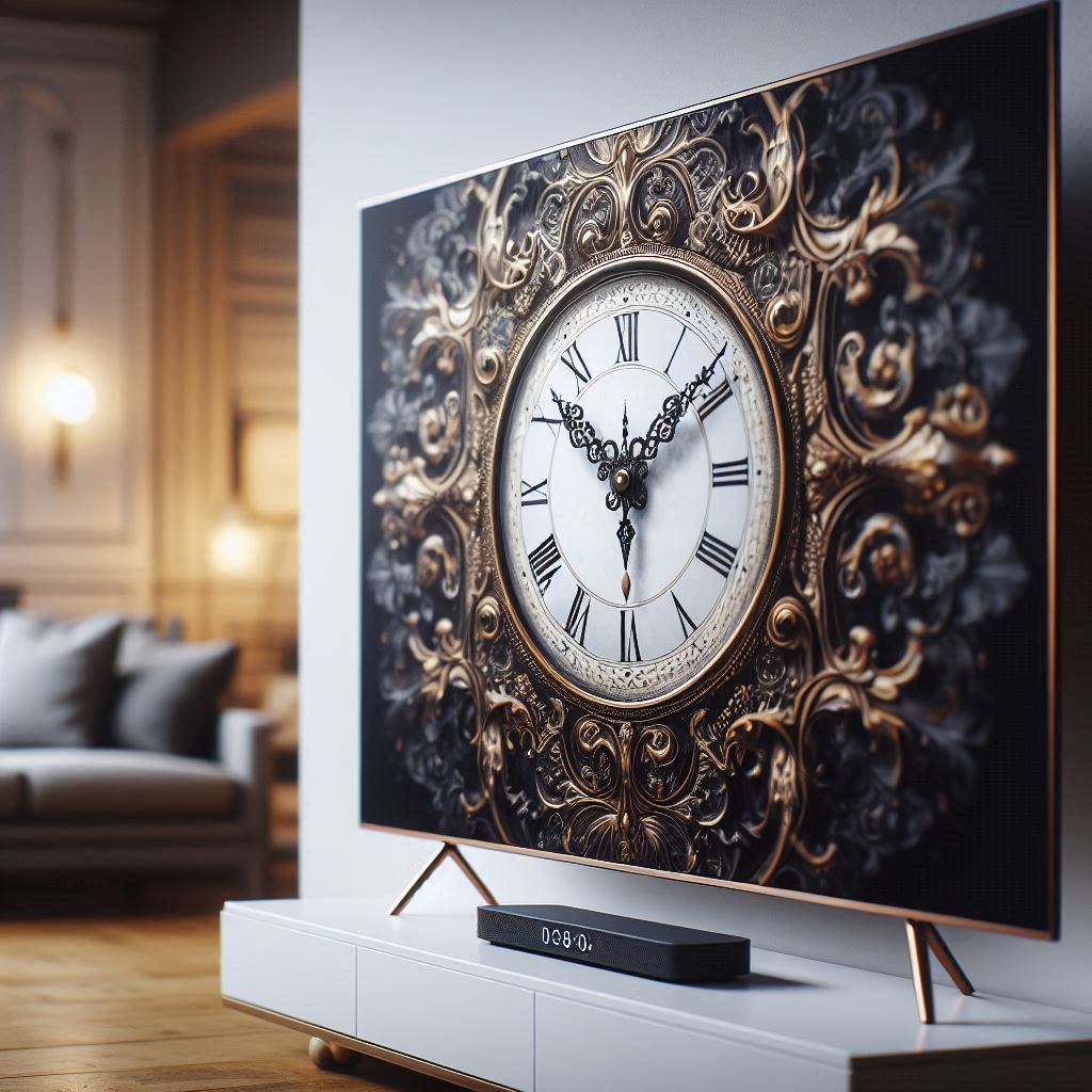
Clock Face Selection: We offered a library of over 100 different clock faces, ranging from classic analog designs to modern digital displays. Users could choose from a variety of styles, including Roman numeral clocks, Bauhaus clocks, and minimalist designs.
Color Schemes: Users could customize the color scheme of the clock display, choosing from a palette of pre-defined color combinations or creating their own custom color schemes.
Hand Styles: We provided a selection of different hand styles, allowing users to choose the shape, size, and color of the clock hands.
Second Hand Display: Users could choose whether or not to display the second hand. Some users prefer a minimalist display without a second hand, while others find the sweeping motion of the second hand to be visually appealing.
Date Display: Users could choose to display the date on the clock face, and they could customize the format of the date display.
24-Hour Mode: Users could switch between 12-hour and 24-hour time formats.
Brightness Control: Users could adjust the brightness of the clock display to suit their viewing environment.
Screen Saver Mode: The clock app could be configured to automatically launch as a screen saver after a period of inactivity.
Remote Control Navigation
Navigating the clock app using a remote control presented a unique set of challenges. We addressed these challenges by designing a user interface that was intuitive and easy to navigate using a directional pad and a limited number of buttons.
Simple Menu Structure: We organized the settings and customization options into a simple, hierarchical menu structure.
Clear Visual Cues: We used clear visual cues to indicate which menu item was currently selected.
Directional Pad Navigation: Users could navigate the menus using the directional pad on the remote control.
Select and Back Buttons: The "select" button was used to confirm a selection, and the "back" button was used to return to the previous menu.
Large Font Sizes: We used large font sizes to ensure that the text was legible from a distance.
Contextual Help: We provided contextual help messages to guide users through the settings and customization options.
Performance Optimization
Optimizing the clock app for performance was crucial to ensure a smooth and responsive user experience on all supported TV platforms.
Efficient Code: We wrote clean, efficient code that minimized resource consumption.
Optimized Graphics: We optimized the graphics for each TV platform, using appropriate image formats and compression techniques.
Caching: We implemented caching strategies to reduce the need to repeatedly load data from storage.
Background Processing: We used background processing to perform tasks that did not require immediate user interaction, such as updating the clock time.
The Final Solution: A Seamless and Customizable Timekeeping Experience
The final solution was a clock app that seamlessly blends the timeless elegance of the analog clock with the capabilities of modern TV technology. The 'clock o clock' offers a visually stunning and highly customizable timekeeping experience, optimized for a wide range of TV platforms.
High-Quality Clock Faces: The app features a library of over 100 high-quality clock faces, meticulously designed to capture the essence of classic and contemporary timepieces.
Customizable Settings: Users can personalize the clock display to their liking, choosing from a variety of color schemes, hand styles, and display options.
Screen Burn-In Mitigation: The app incorporates several screen burn-in mitigation strategies, ensuring that the display remains pristine even after extended use.
Intuitive Remote Control Navigation: The user interface is designed for easy and intuitive navigation using a remote control.
Cross-Platform Compatibility: The app is available on Samsung Tizen TV, LG WebOS TV, Android TV, and Amazon Fire TV, providing a consistent user experience across all platforms.
Screensaver Functionality: The clock can be used as a screensaver, transforming your TV into a beautiful and informative timekeeping device.
Key Takeaways: Lessons Learned
The redesign process yielded several valuable insights:
Prioritize Legibility: Legibility is paramount, especially on large screens viewed from a distance.
Embrace Customization: Users appreciate the ability to personalize their experience.
Address Technical Constraints: Be mindful of the technical limitations of each platform, such as screen burn-in.
Simplify Navigation: Design for intuitive navigation using a remote control.
Iterate and Refine: The design process should be iterative, involving multiple rounds of testing and refinement.
Cross-Platform Consistency Matters: Strive for a consistent user experience across all supported platforms while respecting native UI elements.
Conclusion: Time Well Spent
Redesigning a classic clock interface for a modern TV app was a challenging but ultimately rewarding experience. By carefully considering the technical constraints of each platform, embracing user customization, and prioritizing legibility, we were able to create a clock app that is both visually stunning and functionally seamless. The 'clock o clock' app is a testament to the enduring appeal of the analog clock and its ability to adapt to the ever-changing landscape of technology. It demonstrates how a classic design can be reimagined for a modern audience, providing a touch of elegance and functionality to the living room. The app's success, marked by over 100,000 downloads, underscores the value of thoughtful design and attention to detail in creating a compelling user experience. The lessons learned during this project will continue to inform our design process as we strive to create innovative and engaging apps for the future.